Matter of Sorts is a typographic practice helmed by Vincent Chan and assisted by a slew of co-conspirators. Our interests revolve around notions of commoning, design, pedagogy and type and where they might overlap, co-mingle and meld. Matter of Sorts offers a library of retail typefaces and has developed custom fonts for a diverse range of clients across commercial and cultural sectors, in Australia and abroad.
Matter of Sorts ABN 5734 8145 074
Wurundjeri Land, U702 / 37 Swanston St
Naarm (Melbourne), Victoria 3000 @matterofsorts / mail@matterofsorts.com
Fonts
Our library of retail fonts gives us a chance to engage a particular typographic idiom outside the constraints of a commercial client though, more often than not, they are guided by a collaborator. The offerings below are currently being expanded and are considered incomplete. We are, however, licensing certain styles. If you’d like to know more please email mail@matterofsorts.com.
We are fortunate to have drawn custom typefaces for clients of varying scale and geography, from national institutions to individual artists. We have drawn letters for music festivals, national galleries, orchestras, airports and fashion labels. If you’re interested in commissioning a typeface or just want to know more about the process, please get in touch at mail@matterofsorts.com.
We are priviledged to work on the sovereign land and waters of the Wurundjeri people of the Kulin Nation. For over 60,000 years the Wurundjeri Willam people gathered and thrived here. We acknowledge that this land was never ceded and that colonisation continues today.
Vincent completed his doctorate in 2021 at Monash Art Design & Architecture where his research explored alternative models of typographic practice. He has been a contributing winner and finalist in numerous Australia Graphic Design Association and Designers Institute of New Zealand Best Design awards and in 2019 was granted an Ascender award from the Type Directors Club—one of ten international winners recognised for ‘expanding the medium of typography’.
He was previously a sessional lecturer at RMIT University and course coordinator of Typography 1 and Type Design at Monash Art, Design and Architecture where he taught for over a decade. Vincent has presented at numerous international conferences and symposiums including the Association Typographique Internationale and the Melbourne Art Book Fair.
Alongside Dominic Hofstede and Robert Janes, Vincent co-directs the typographic (ad)venture Counter Forms. Counter Forms exists as a platform to champion emerging, discursive, antipodean type designers. Driven by typographic research, education and advocacy, we publish original typefaces and texts towards a more accessible, diverse and equitable future. Follow us over at @counter__forms.
Cassette
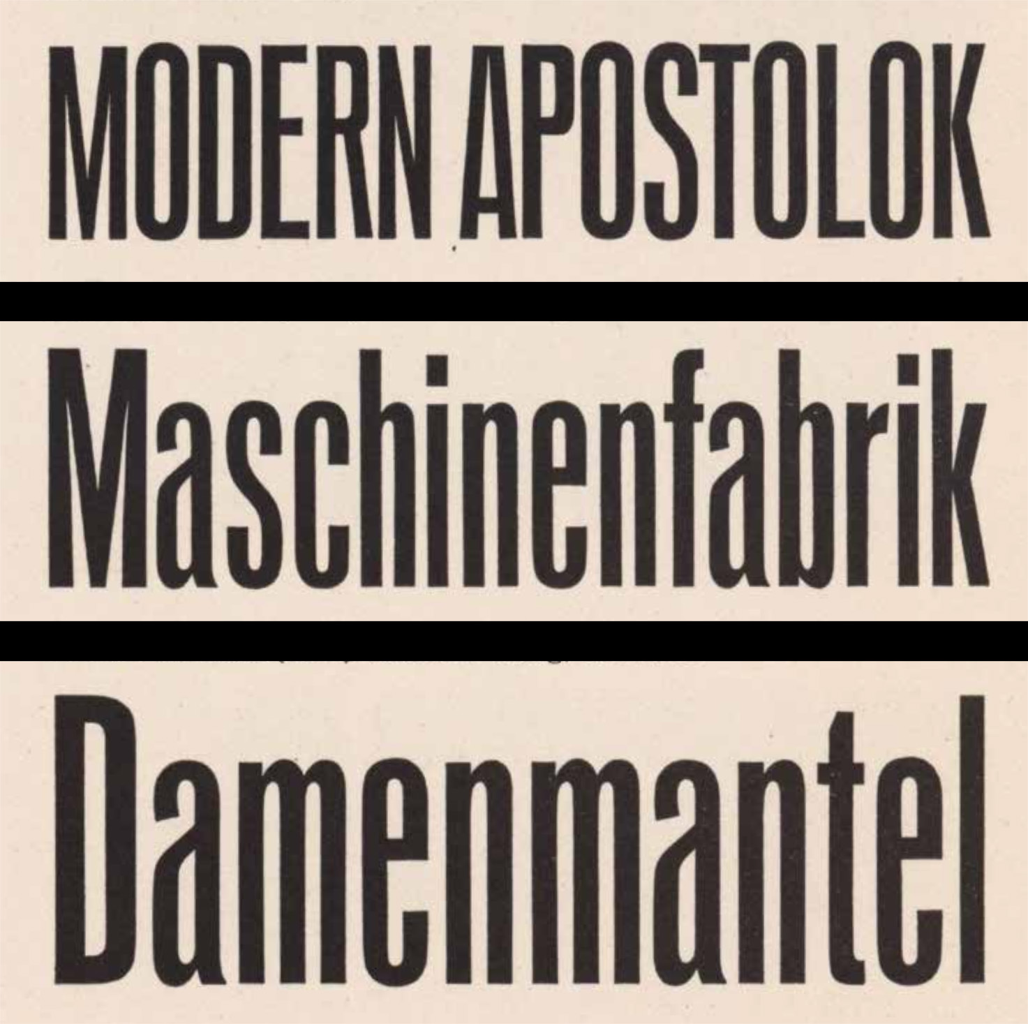
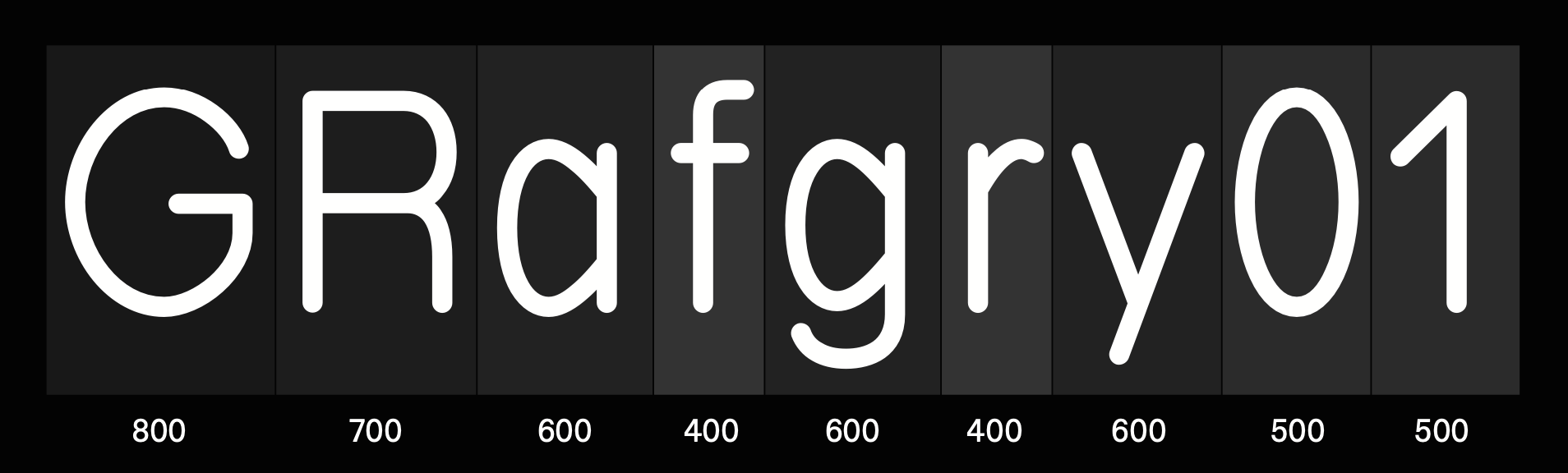
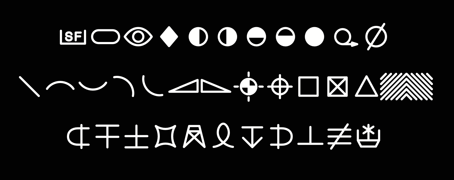
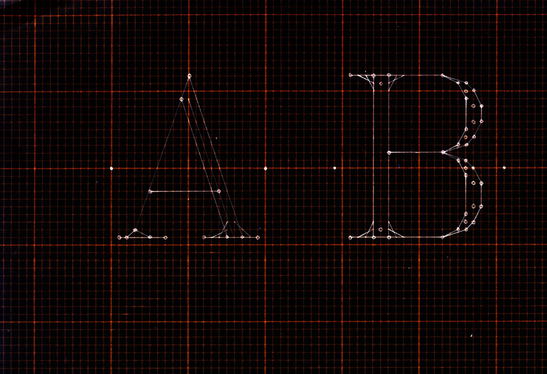
Cassette is inspired by three primary sources: the technical lettering commonly found in routing and plotter environments, typewriter gothics faces and Dr Allen Hershey’s Hershey Fonts. It began as a unused concept for a custom typeface and evolved into its current state. Cassette is a *skeleton* font whereby weight is added by increasing the thickness of its stroke. It is the house face of the typographic (ad)venture Counter Forms.
Adjustable Scriber, Adolf W. Keuffel. Patent US2011195A, 13 August 1935.
An excerpt from Typewriter Type Faces, Allan Bartram, Footnotes A, 2016.
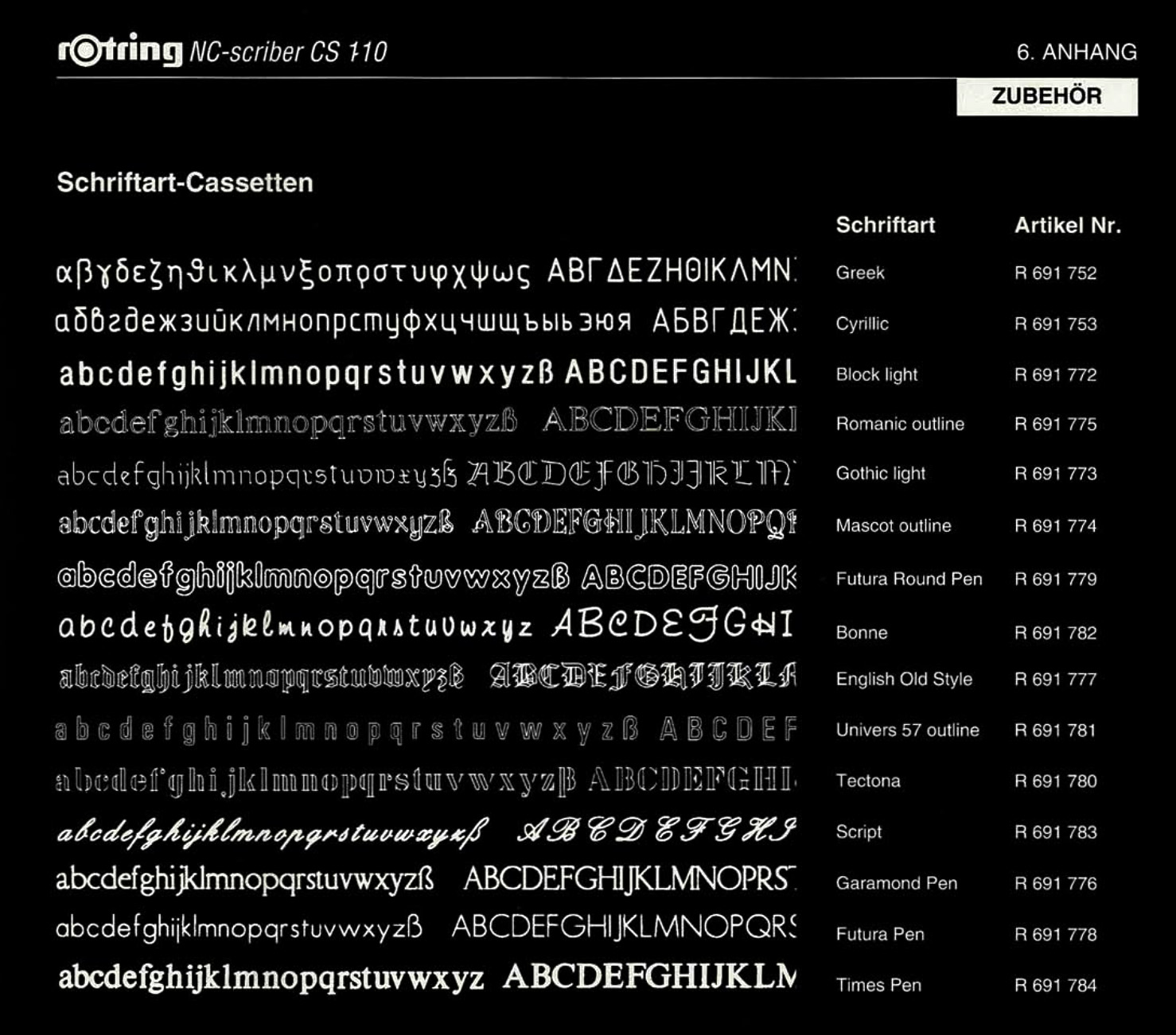
The Rotring NC-Scriber CS 110 , Germany 1993.
An excerpt from A Contribution to Computer Typesetting Techniques, Dr. Allen V. Hershey, 1976.
CassetteHairline
Standardization
CassetteLight
Quadrumvirates
CassetteRegular
Middlesborough
CassetteMedium
Electrochemical
CassetteBold
Gloucestershire
Syllabus
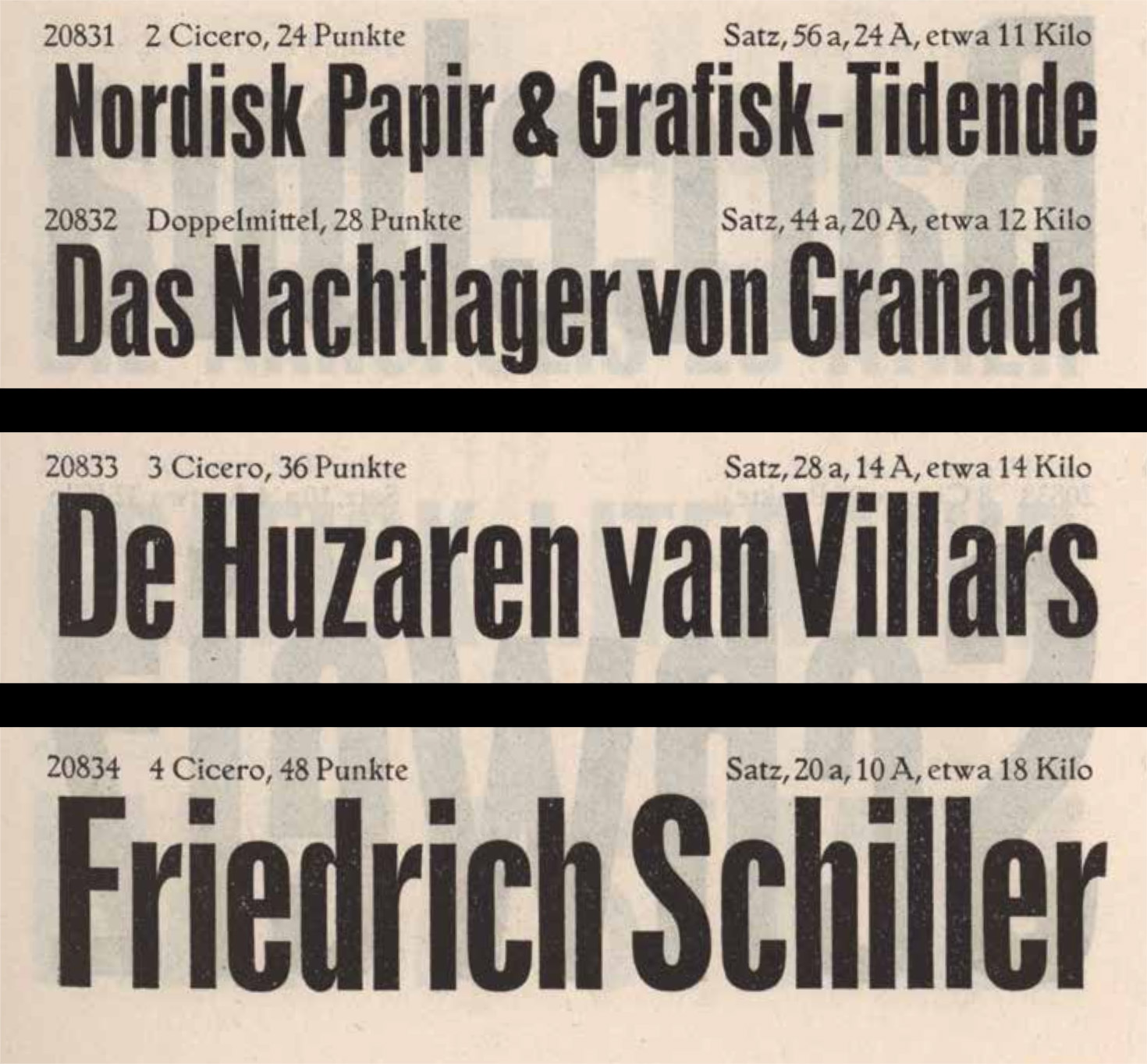
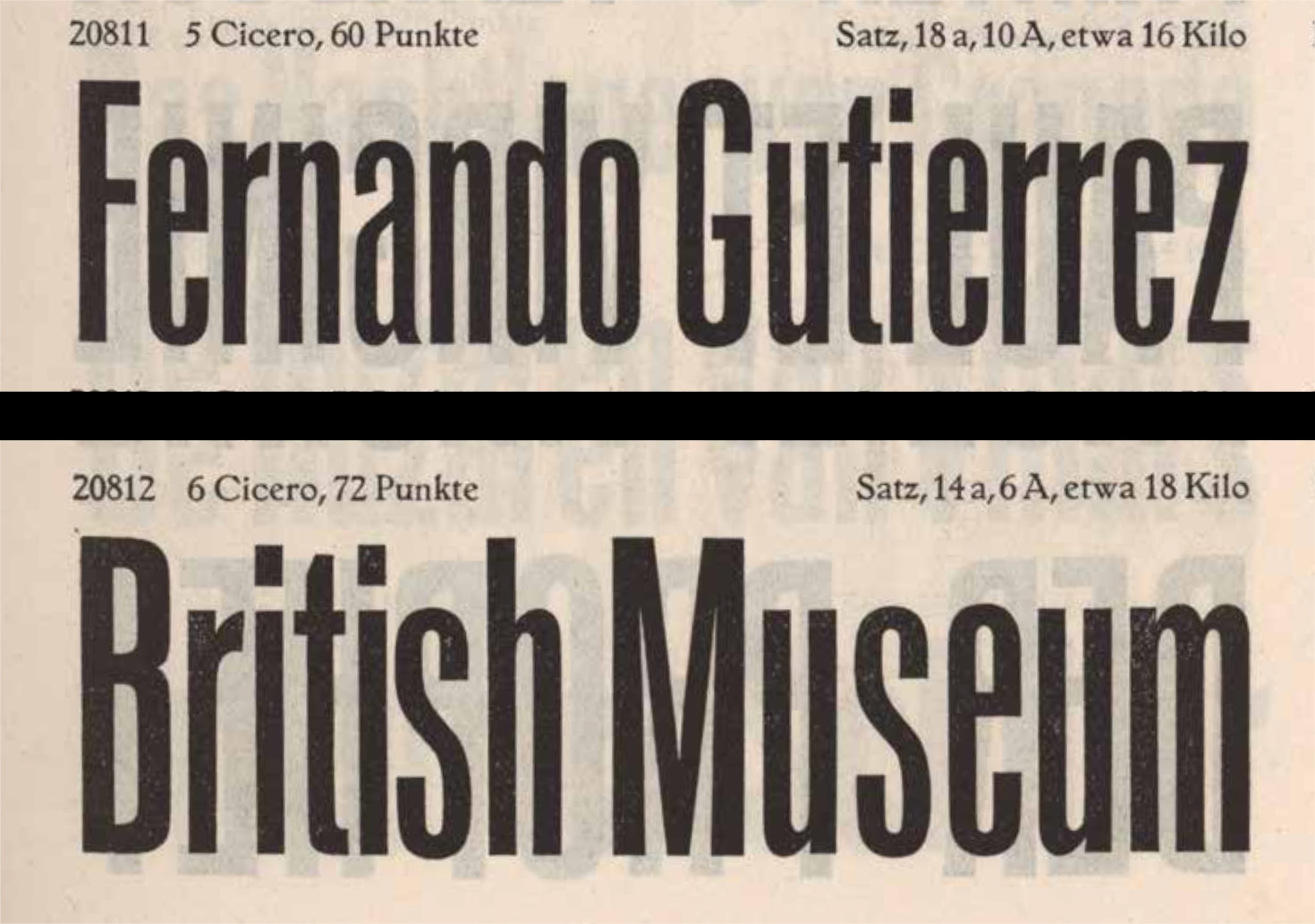
Syllabus is a contemporary consideration of Plantin, the much-loved book face published by Monotype in 1913 and overseen by Frank Hinman Pierpont. Syllabus returns to the same source material, a Gros Cicero cut in the sixteenth century by Robert Granjon, and features a crisper finish and a more serviceable italic. Syllabus was initially drawn to match the proportions of custom typeface Preston for the Art Gallery of NSW but has since learned to stand on its own two feet.
Granjon’s Pica Roman or Cicero, 1559
Syllabus and Preston share sympathetic proportions.
Syllabus in use: The Exhibitionists, designed by Dominic Hofstede (Mucho Melbourne)
Syllabus in use: The Exhibitionists, designed by Dominic Hofstede (Mucho Melbourne)
SyllabusRegular
Instrumentalist
SyllabusRegular Italic
Epidemiological
SyllabusMedium
Autobiography
SyllabusBold
Crosshatching
SyllabusExtrabold
Dematerialize
SyllabusBlack
Reproduction
Staunch Titling
Staunch Titling was drawn for a project run by the Melbourne Housing Research Group which never materialised. Art direction was provided by Paul Mylecharane and Stuart Geddes. Staunch casually references the awkwardly set type on the cover of Psycholinguistics: Chomsky and Psychology by Judith Greene, designed by Omnific/Derek Birdsall.
Psycholinguistics, cover designed by Omnific/Derek Birdsall.
Staunch in use: Public Galleries poster campaign, Pigeon Ward 2023.
Staunch in use: Public Galleries sticker collateral, Pigeon Ward 2023.
Staunch in use: Hot Air, Raafat Ishak, Sonntag Press, 2023.
Staunch Titling CondBold
Transatlantic
Staunch Titling CondBold
Lexicographer
Staunch Titling X CondBold
Interdisciplinary
Staunch Titling X CondBold
Photomechanical
Field Grot Cond
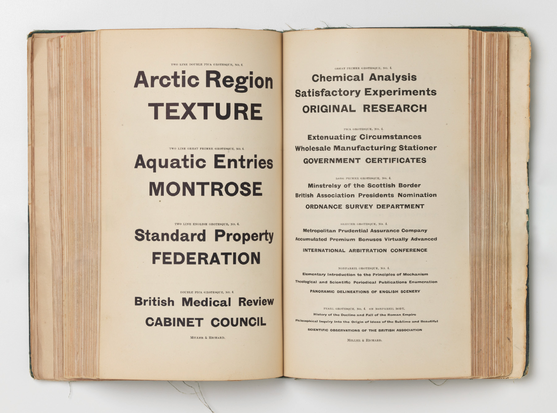
Field Grot was designed in collaboration with Stuart Geddes for The Field Revisited, a 50-year restaging of the iconic exhibition at the National Gallery of Victoria. Its point of departure is an anonymous bold sans serif used on the spine of the 1968 catalogue bolstered by nods to the early British grotesques of the Miller & Richard foundry. The condensed cut also finds resonance with Monotype Grotesque Bold Condensed.
The Field Exhibition catalogue, 1968.
Grotesque Bold Condensed 81, Specimen Book of Monotype Printing Types, 1969.
The spines of the original catalogue, the facsimile and The Field Revisited catalogue.
A detail of The Field Revisited, designed by Stuart Geddes, 2018.
Field Grot CondThin
Hypercholesterolaemia
Field Grot CondLight
Compartmentalisation
Field Grot CondRegular
Buckminsterfullerene
Field Grot CondMedium
Dendrochronological
Field Grot CondBold
Chemiluminescence
Field Grot CondBlack
Greatgrandchildren
Field Grot Narrow
The narrow width of Field Grot is ideal for headlines and subheads where economy is a consideration.
Field Grot NarrowThin
Interdenominational
Field Grot NarrowLight
Electroluminescent
Field Grot NarrowRegular
Underachievement
Field Grot NarrowMedium
Reimplementation
Field Grot NarrowBold
Circumnavigation
Field Grot NarrowBlack
Phototypesetting
Field Grot
The standard width of Field Grot takes the core DNA of the condensed styles and relaxes their proportion, allowing it to be better suited to body copy.
Field GrotThin
Psycholinguistics
Field GrotLight
Hyperventilation
Field GrotRegular
Synchronisation
Field GrotMedium
Knuckledusters
Field GrotBold
Claustrophobia
Field GrotBlack
Undergraduate
Field Grot Wide
As the widest style of Field Grot, a more geometric rhythm comes into play with almost cirular Os and an overall wider gait.
Field Grot WideThin
Australopithecus
Field Grot WideLight
Demineralization
Field Grot WideRegular
Internationalism
Field Grot WideMedium
Crystallography
Field Grot WideBold
Telephotograph
Field Grot WideBlack
Revalorizations
Article Text
Article Text is a Dutch book face loosely referencing Christoffel Van Dyck’s Augustijn Romeyn. After a dormant 6 months wallowing in insecurity, Article was pushed along with art-direction provided by Brad Haylock specifically for use in Art Writing in Crisis, published by Sternberg Press.
Augustijn Romeyn, Christoffel van Dyck, 1682.
Augustijn Cursijs, Christoffel van Dyck, 1682.
Article in use: Art Writing in Crisis, eds. Brad Haylock, Megan Patty, Sternberg Press, 2021.
Article in use: Art Writing in Crisis, eds. Brad Haylock, Megan Patty, Sternberg Press, 2021.
Article TextLight
Telephotograph
Article TextRegular Italic
Electrodynamics
Article TextMedium
Sentimentalize
Article TextBold Italic
Congressperson
Article TextExtrabold
Intellectualise
Article TextBlack Italic
Parallelogram
Quadrant Text
Quadrant is a contemporary ionic amalgamating aspects of the well-known Clarendon genre across different continents with freedom and affection. It draws on the original ionics of British giants, Miller & Richard and Stephenson, Blake & Co., the transplanted Antiques of the American Type Founders, and the imported and renamed sorts from Australia’s F.T. Wimble & Co.
Quadrant Text in use: Surfing World, designed by Stuart Geddes and Ziga Testen
Quadrant Text in use: Kerstin Thompson Architects: Encompassing people & place, Stuart Geddes, 2021.
Quadrant Text in use: Detail of Robert Owen: A Book of Encounters, Stuart Geddes, Paul Mylecharane & Kim Mumm Hansen, 2021.
Quadrant TextLight
Transcription
Quadrant TextRegular Italic
Intellectualize
Quadrant TextMedium
Zimbabweans
Quadrant TextSemibold
Metamorphic
Quadrant TextBold
Parenthesise
Quadrant TextExtrabold
Hypertrophy
Quadrant TextBlack
Kettledrums
Quadrant Text Mono
Quadrant Text Mono is the monospaced counterpart to Quadrant Text. Currently only a regular weight exists with plans to extend to a full weight range.
Quadrant Text Mono in use: Harvey Sutherland EP, designed by TRiC.
Quadrant Text Mono in use: Harvey Sutherland EP, designed by TRiC.
Quadrant Text Mono in use: Harvey Sutherland EP, designed by TRiC.
Quadrant Text Mono in use: Harvey Sutherland EP, designed by TRiC.
Quadrant Text MonoRegular
Pointillism
Quadrant Text MonoRegular Italic
Overzealous
Quadrant Text MonoRegular
Loudspeaker
Quadrant Text MonoRegular Italic
Telekinetic
Quadrant Slab Duo
Quadrant Slab Duo is a duo-spaced slab-seriffed iteration of Quadrant Text with low contrast and the faintest of bracketing.
Quadrant Slab DuoThin
Narcoleptic
Quadrant Slab DuoThin Italic
Quadrillion
Quadrant Slab DuoThin
Horseradish
Quadrant Slab DuoThin Italic
Marginalize
Turnery
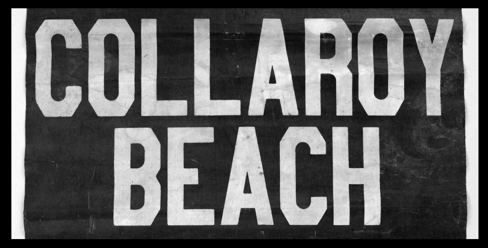
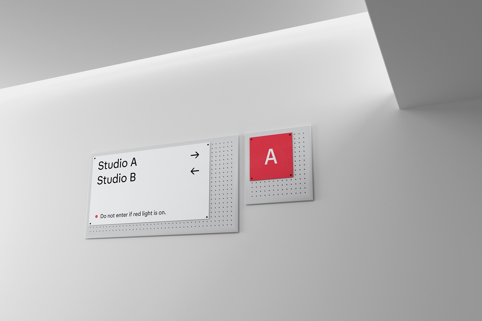
Turnery is a nondescript, workmanlike face that takes cues from building fascia lettering around Collingwood and its neighbouring suburbs. Its wide stately capitals and economical finish embody an air of industry and anonymity. Originally sketched in 2018, it took on new life under a commission by The Company You Keep branding not-for-profit arts organization and arts precinct, Collingwood Yards.
Turnery in use: identity design for Collingwood Yards by The Company You Keep.
Turnery in use: Collingwood Yards signage and wayfinding, The Company You Keep and Jordan Rowe.
Turnery in use: Collingwood Yards signage and wayfinding, The Company You Keep and Jordan Rowe.
Turnery in use: Collingwood Yards signage and wayfinding, The Company You Keep and Jordan Rowe.
TurneryRegular
Transcendental
TurneryRegular Italic
Photosynthetic
TurneryMedium
Gyrostabilisers
TurneryBold
Seismographic
Recollection Banner
Recollection attempts to capture the spirit of Australian graphic design between 1960–1990. It refers to this rich period by looking inward, through the well-established intentions and aesthetic tropes of the time, to arrive at a familiar typographic form. The Recollection typefaces were instigated by Dominic Hofstede as a response to his ongoing archival project Re:collection.
Recollection type specimen, Dominic Hofstede, 2013.
Recollection flyer, Dominic Hofstede, 2013.
Recollection BannerHairline
Microprocessor
Recollection BannerThin
Hydrocortisone
Recollection BannerLight
Thermoelectric
Recollection BannerRegular
Superchargers
Recollection BannerMedium
Extravehicular
Recollection BannerBold
Acquaintance
Recollection BannerExtrabold
Intelligentsia
Recollection BannerBlack
Dostoyevsky
Recollection Display
Recollection Display is better suited to headlines and subheads. It features a double storey a.
Recollection DisplayThin
Thermodynamics
Recollection DisplayLight
Entrepreneurship
Recollection DisplayRegular
Inextinguishable
Recollection DisplayMedium
Microcomputers
Recollection DisplayBold
Conquistadores
Recollection DisplayExtrabold
Selfdestruction
Recollection Text
Recollection Text is drawn to be used at text sizes. A double-storey a also replaces the single-storey of the Banner cut and it is more loosely spaced.
Recollection TextLight
Anthropomorphism
Recollection TextRegular
Radioastronomical
Recollection TextMedium
Geomorphologists
Recollection TextBold
Thermodynamical
Recollection Mono
Recollection Mono is the monospaced counterpart to the Text cut and comes in four weights.
Recollection MonoLight
Palaeontologists
Recollection MonoRegular
Transformational
Recollection MonoMedium
Incontrovertible
Recollection MonoBold
Phototypesetting
AGSA
AGSA is a custom typeface extrapolated from the Art Gallery of South Australia’s logotype. Its narrow, no-nonsense forms reference fonts like Enge, Reform and Inserat Grotesk, providing a distinct voice for the institution. Its bold low contrast stokes are offset by hairline diacritics and punctuation creating textural variation and interest
Reform Grotesk, Gebrüder Klingspor Offenbach, circa 1920
Enge Grotesk, designers unknown, Haas c.1870.
AGSABold
AGSABold
AGSABold
AGSABold
AGSABold
Help Type
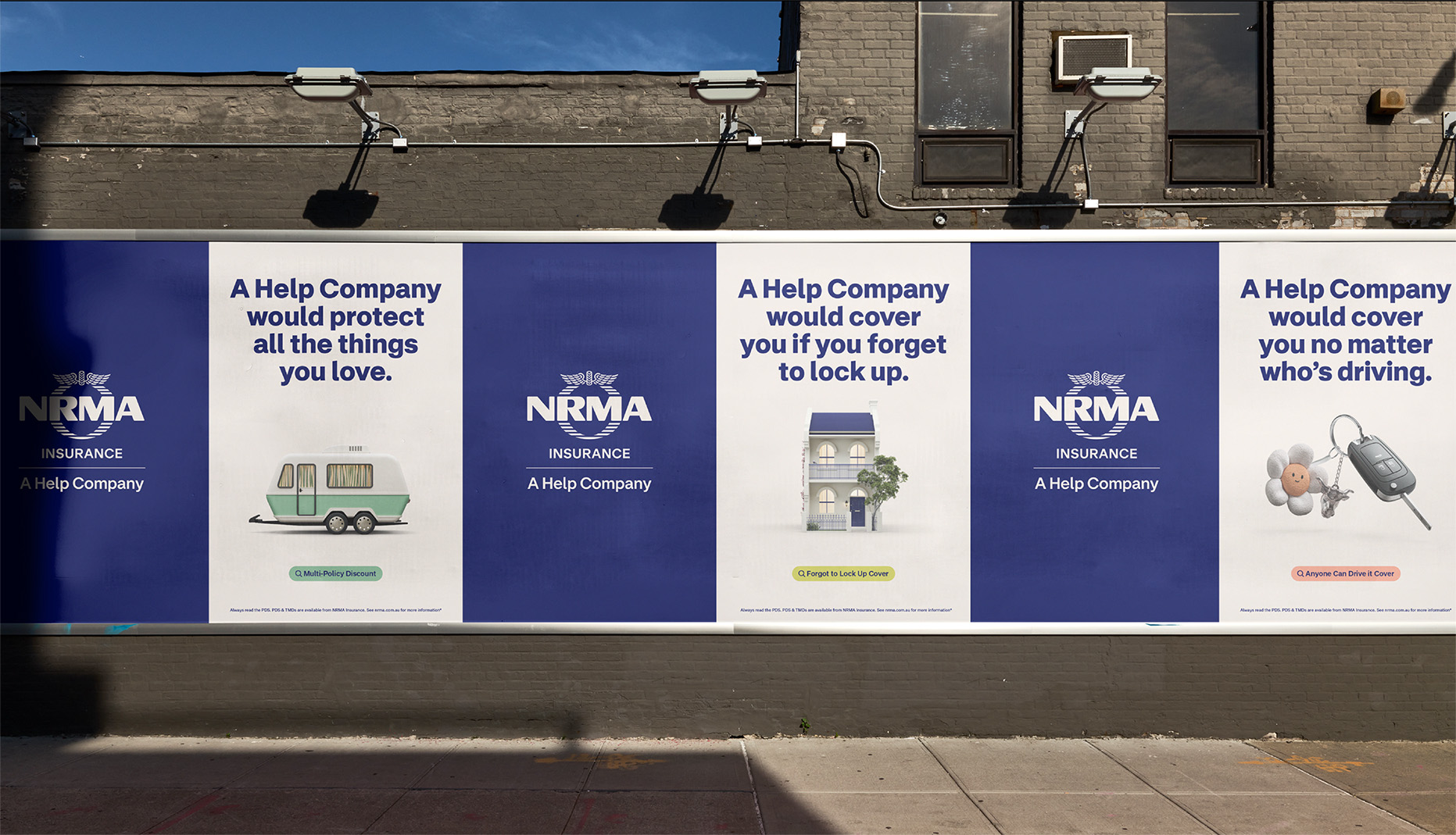
Help Type is the brand typeface of NRMA Insurance. Drawing on neo-grotesque stalwarts like Dick Dooijes’ Mercator, its warm, assured forms communicate utility yet humanity. Help Type comes in dedicated Display, Text and Office fonts and supports an extended Latin character set including coverage for Vietnamese and all Aboriginal languages.
NRMA poster campaign, Droga5.
NRMA mobile app, Droga5.
Neuzeit Grotesk, Wilhelm Pischner, 1932.
Mercator, Dick Dooijes, 1957.
Help Type DisplayLight
Help Type DisplayRegular Italic
Help Type DisplayMedium
Help Type DisplayBold Italic
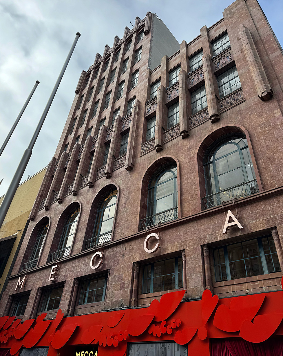
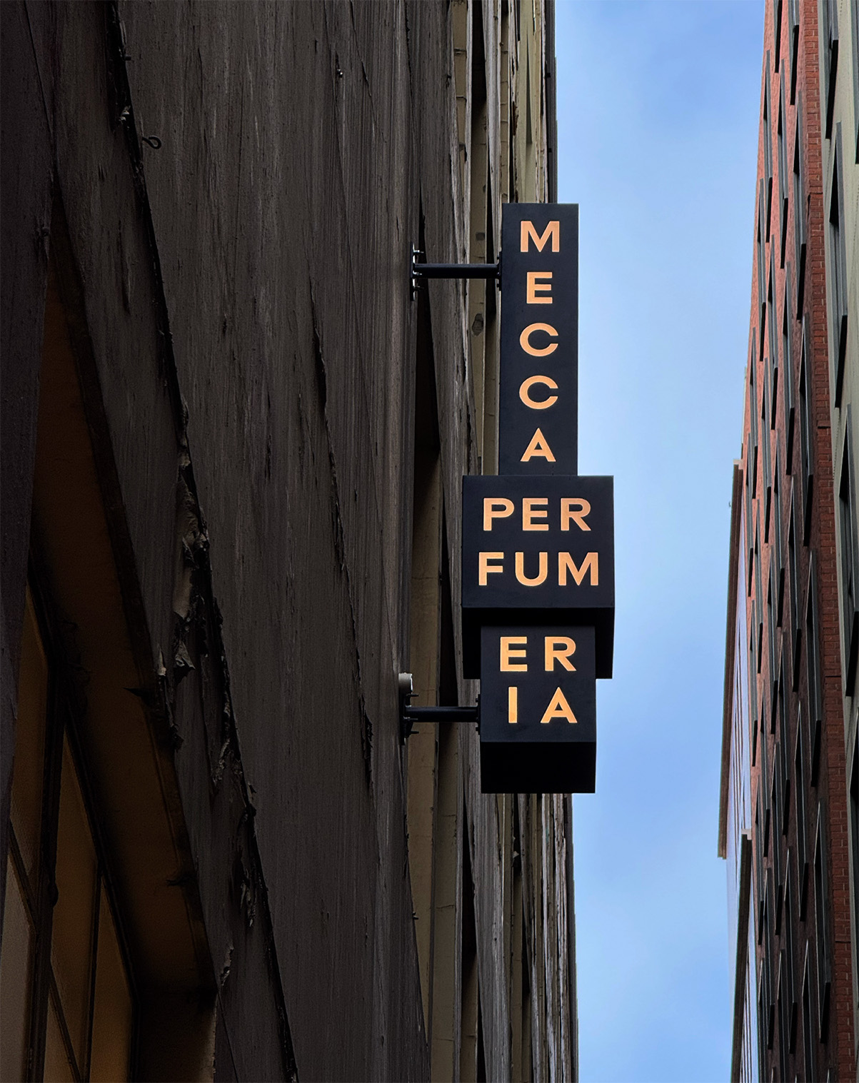
Mecca Directional
Mecca Directional is a suite of typefaces for Mecca’s flagship store on Bourke Street in Melbourne. Drawing from early American gothics and British grotesques, it balances the geometry of the Mecca logo with the energy of early sans serifs. Its distinct numerals are drawn specifically for room signage allowing for heightened expression.
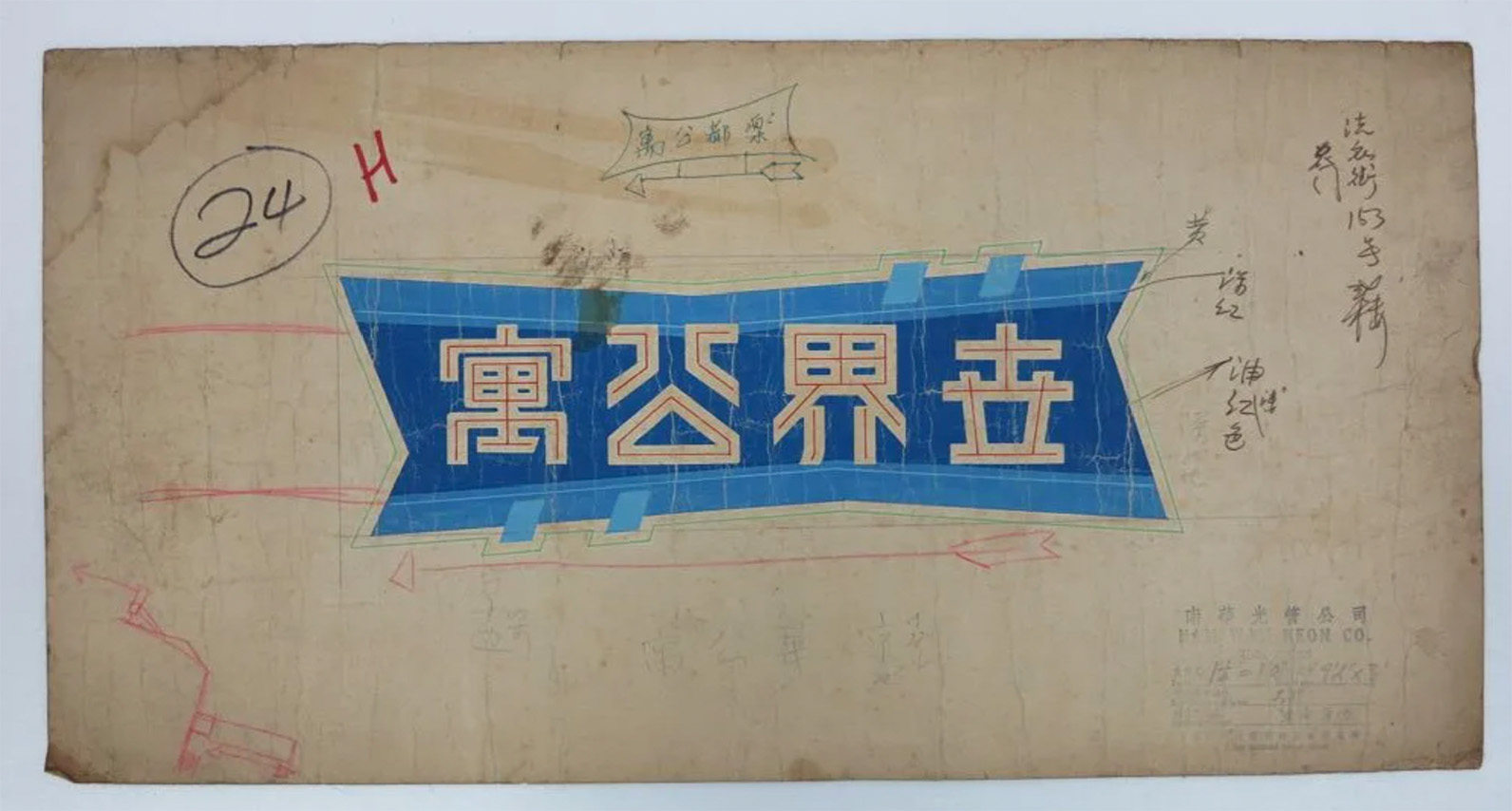
HK Remix is a collection of fonts drawn for the Hong Kong Tourism Board. Referencing vernacular letterforms such as neon signage and signpainting, its pragmatic, condensed base alphabet is accompanied by three styles of varying effects: outline, neon and shadow, in two optical sizes.
Nam Wah Neonlight & Electrical. c.1970. M+, Hong Kong. Gift of Nam Wah Neonlight & Electrical Manufactory, Ltd., 2015.
Nam Wah Neonlight & Electrical. c.1950. M+, Hong Kong. Gift of Nam Wah Neonlight & Electrical Manufactory, Ltd., 2015.
Neon sign, @streetsignhk.
HK RemixBold
HK RemixInline
HK RemixNeon
HK RemixShadow
HK Remix SmallBold
HK Remix SmallInline
HK Remix SmallNeon
HK Remix SmallShadow
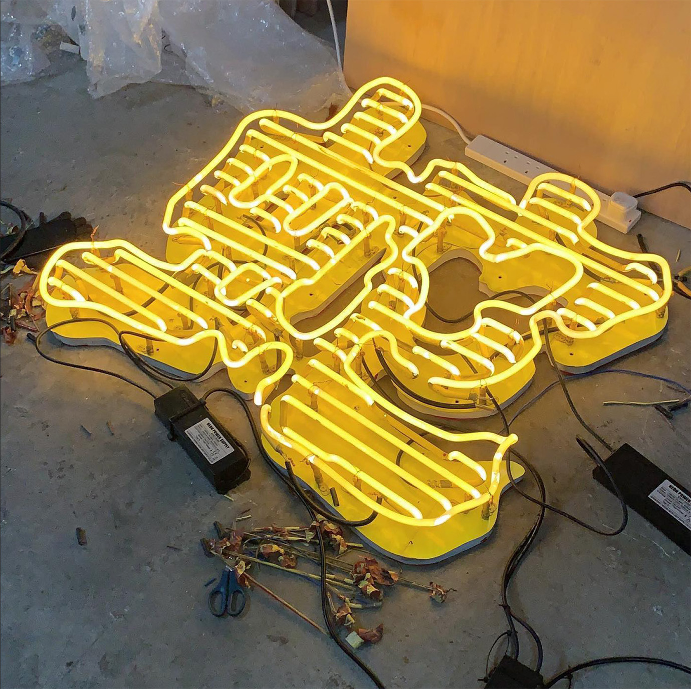
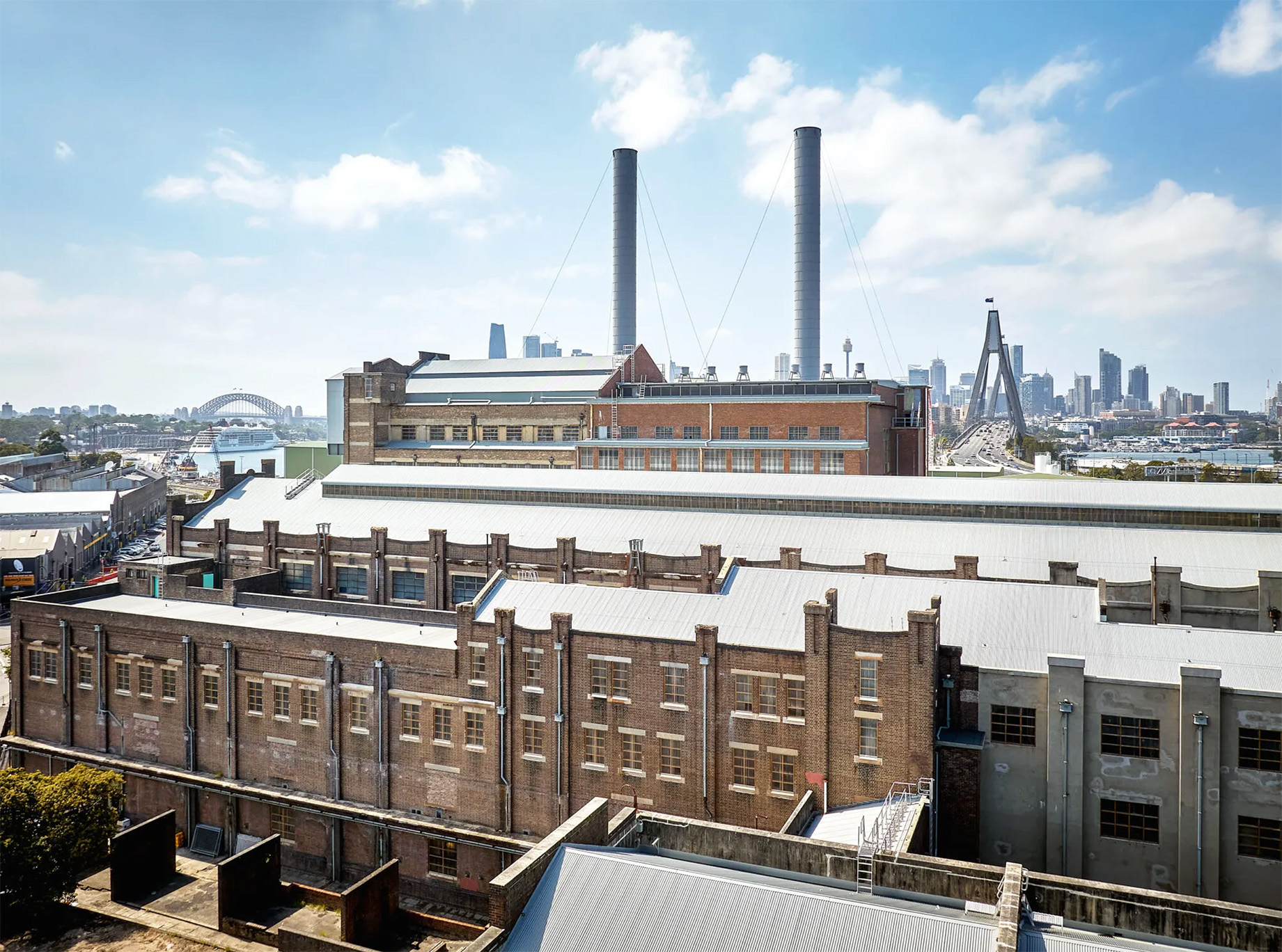
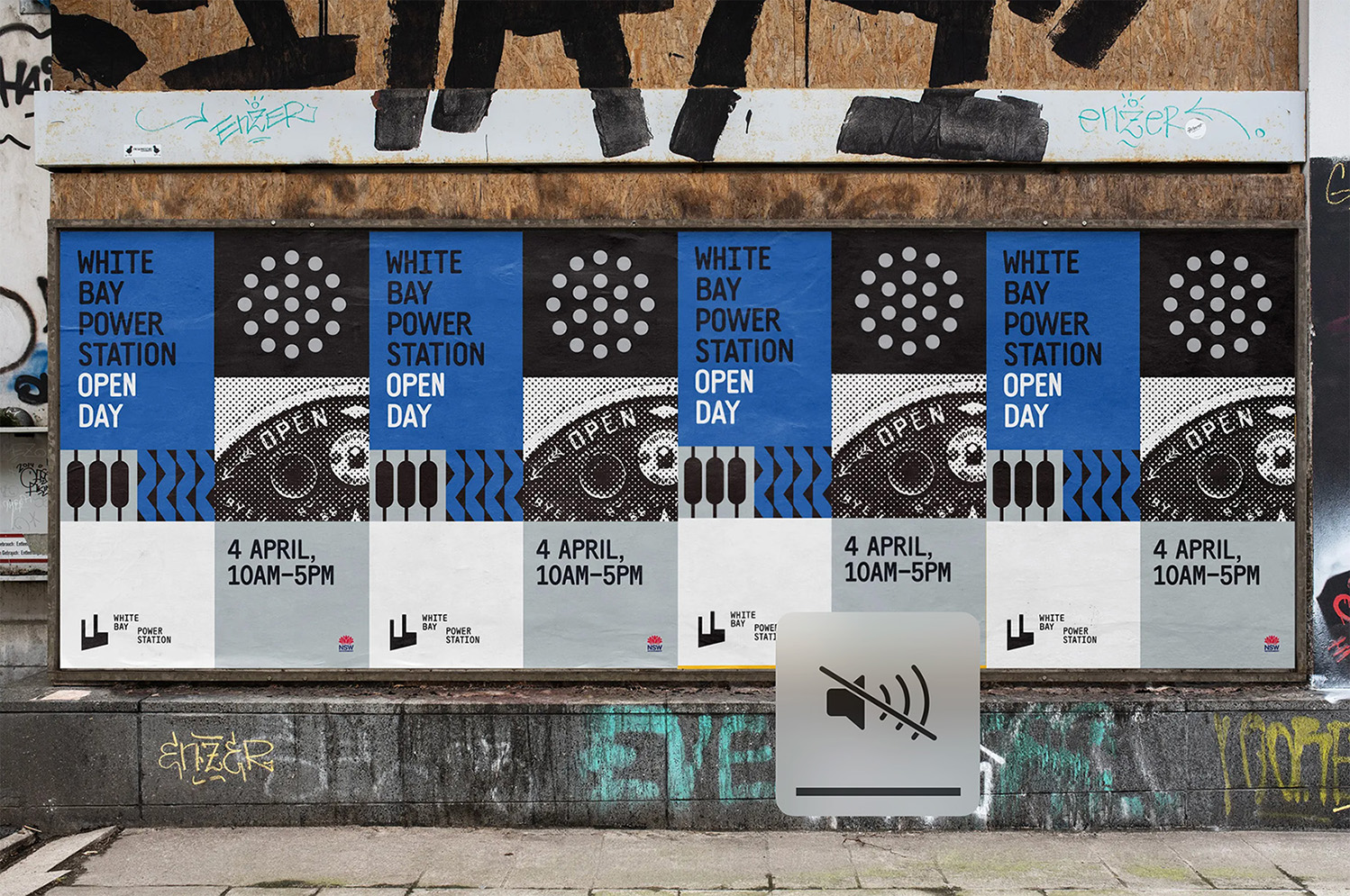
White Bay
The White Bay typeface draws from vernacular letterforms found at the White Bay Power Station. From hand-painted labels to routed signs, the typeface intentionally embodies a certain regular irregularity. It’s undulating baseline, changing letter widths and variation in rounding create a vitality that speaks to the unique site.
White Bay Power Station. Image credit: Garbett Design.
White Bay Power Station branding paset up. Image credit: Garbett Design.
White BayMedium
White BayMedium
White BayMedium
White BayMedium
White BayMedium
White BayMedium
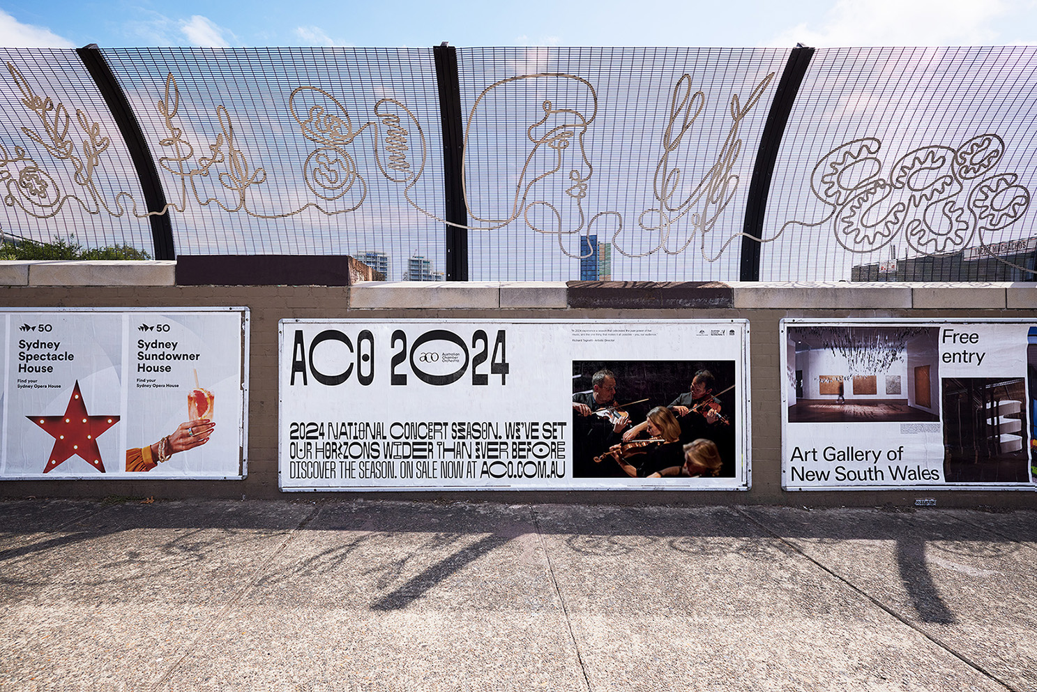
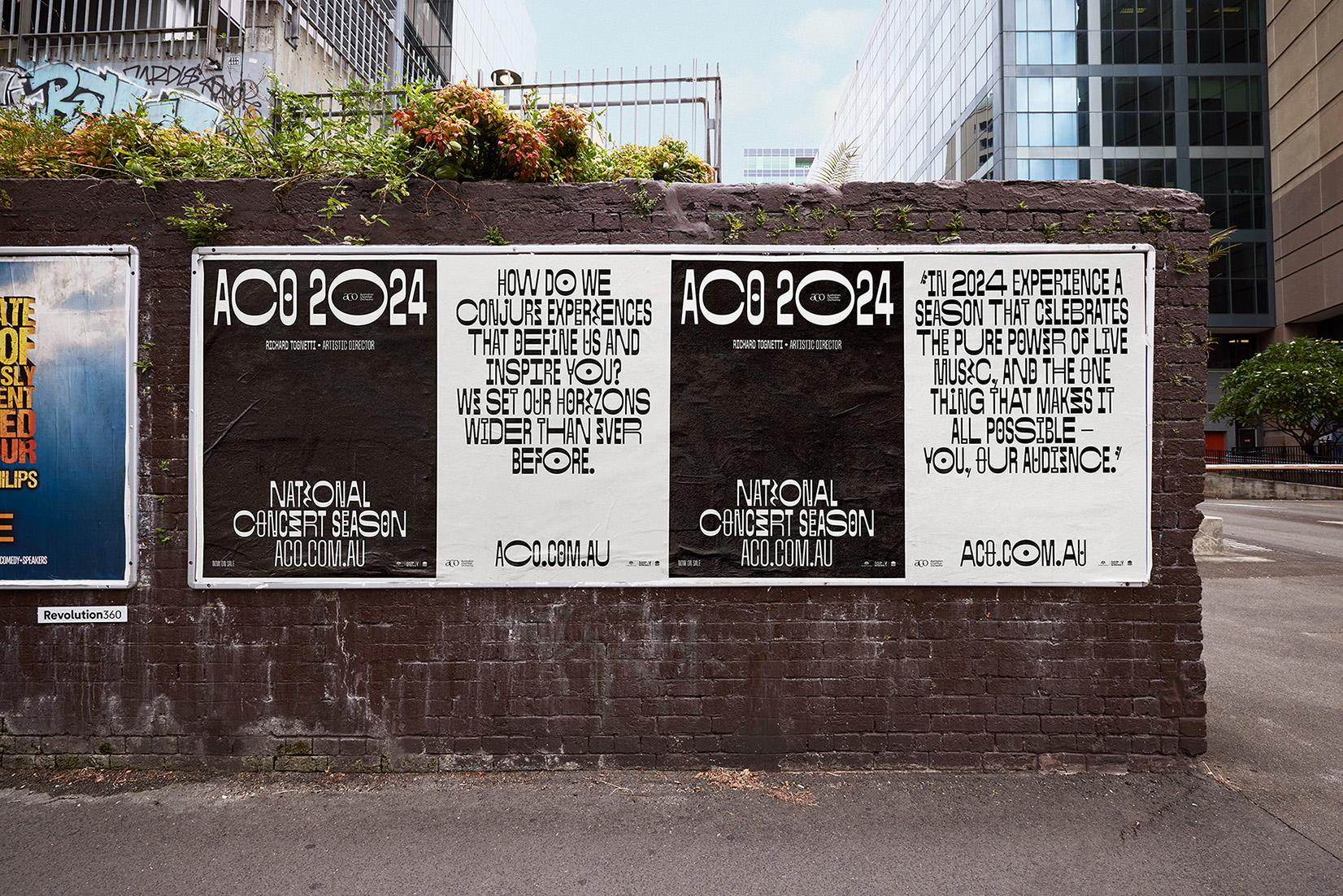
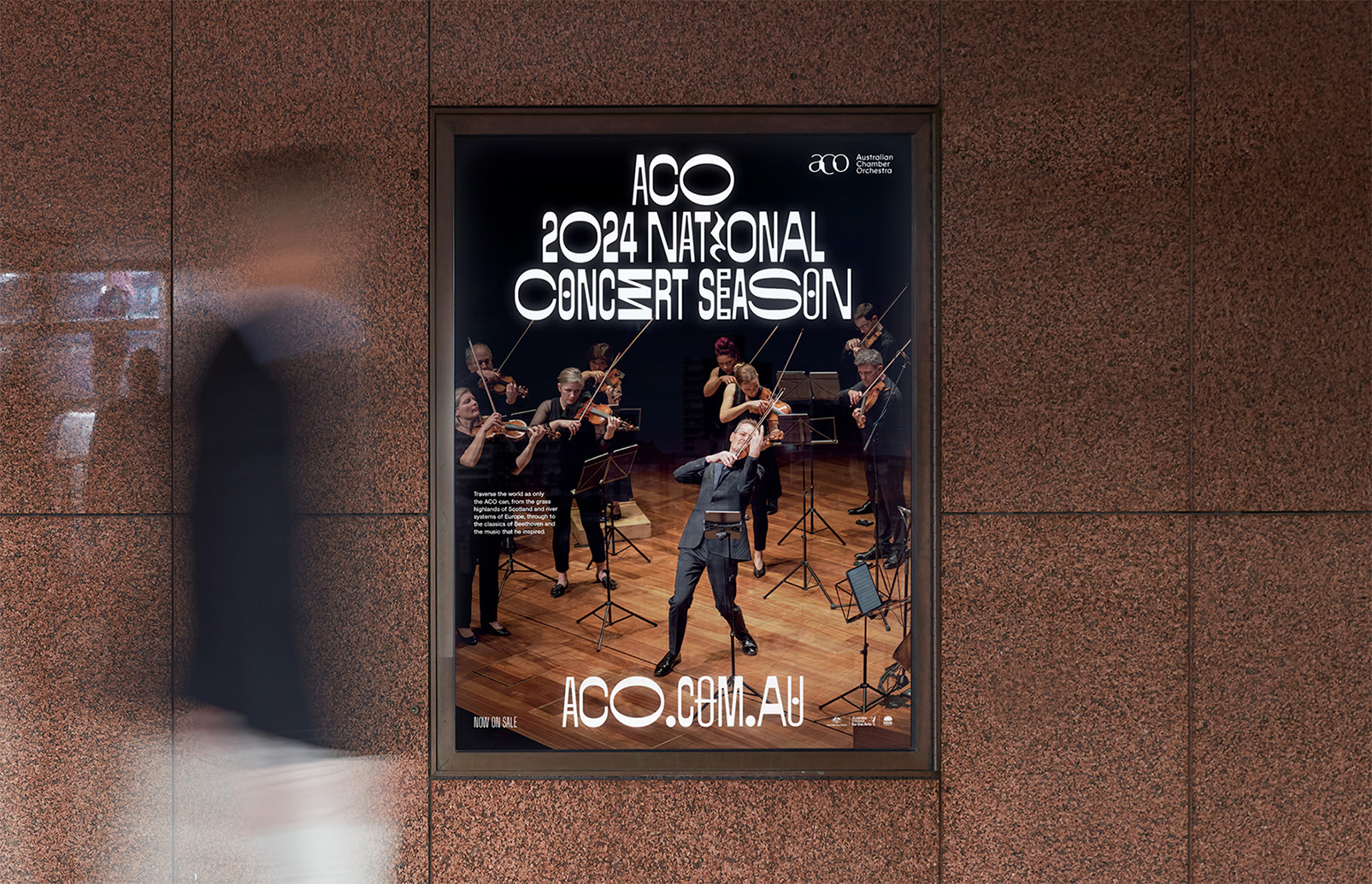
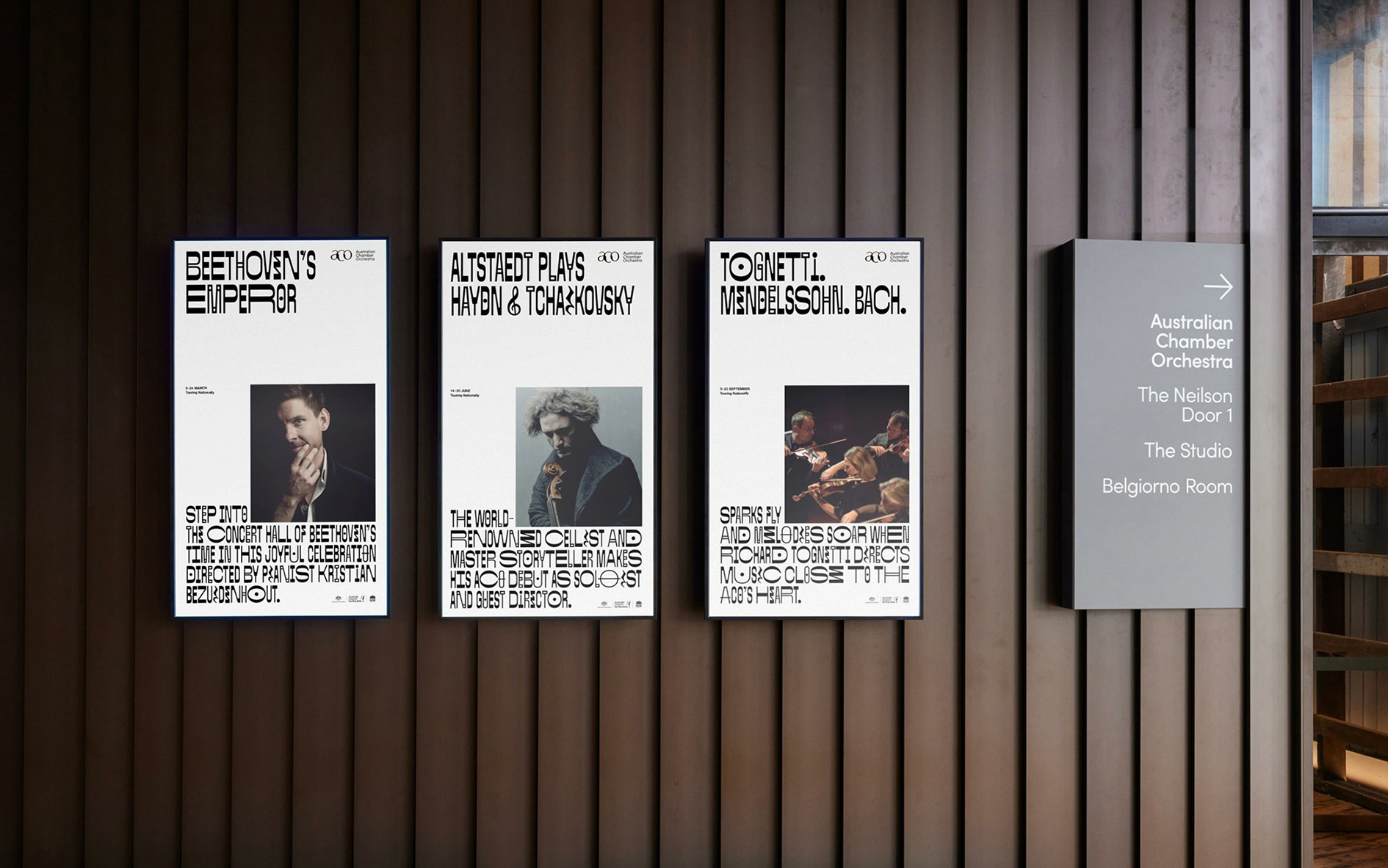
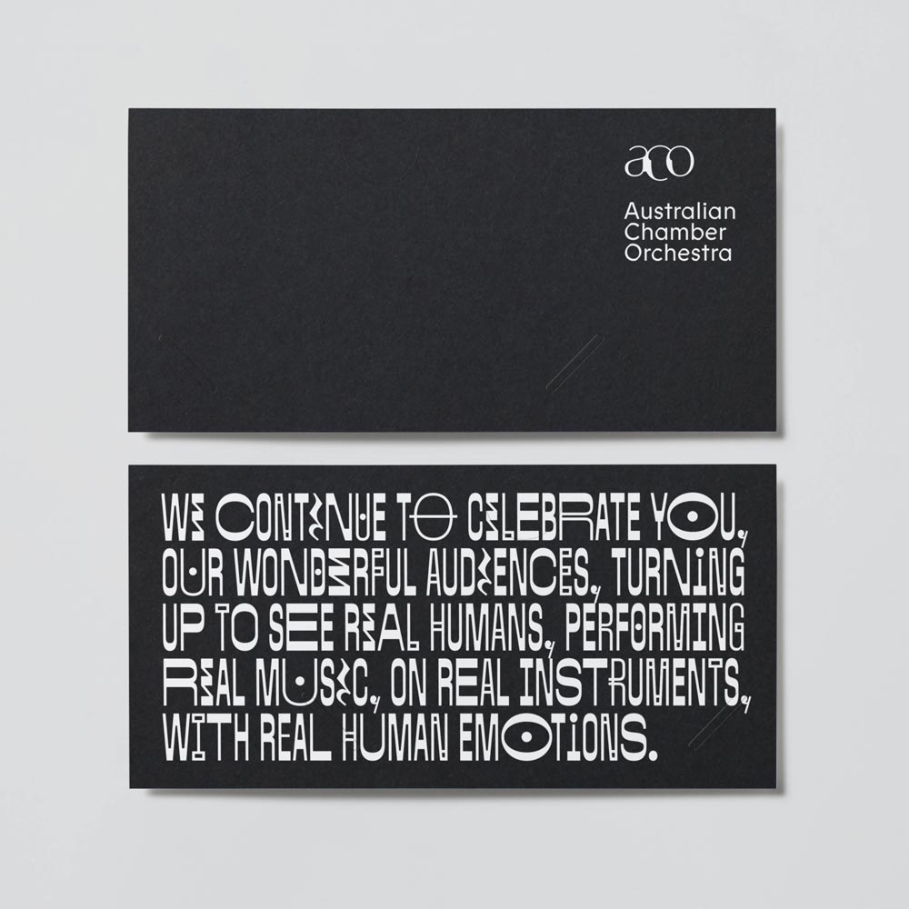
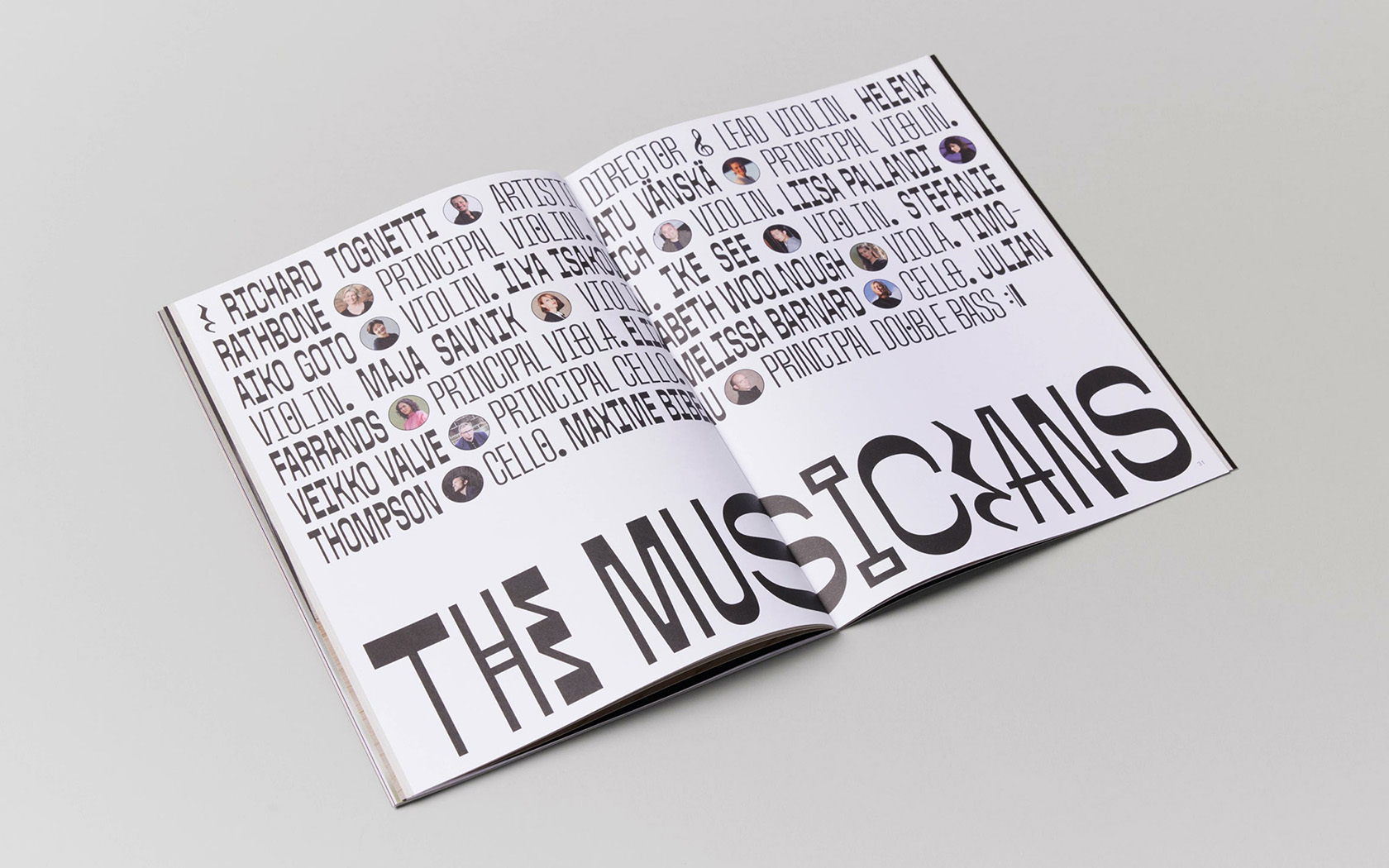
ACO Sans
ACO Sans was drawn for the Australian Chamber Orchestra and commissioned by Moffitt.Moffitt. in collaboration with Tame Feral Studio. ACO Sans is defined by its reverse contrast, multiple widths, a cacophony of alternates and musical-notation-inspired glyphs.
2025 ACO campaign. Image credit: Moffitt.Moffitt.
2025 ACO campaign. Image credit: Moffitt.Moffitt.
2025 ACO campaign. Image credit: Moffitt.Moffitt.
2025 ACO campaign. Image credit: Moffitt.Moffitt.
2025 ACO campaign. Image credit: Moffitt.Moffitt.
2025 ACO campaign. Image credit: Moffitt.Moffitt.
ACO SansMedium
ACO SansMedium
ACO SansMedium
ACO SansMedium
Telstra
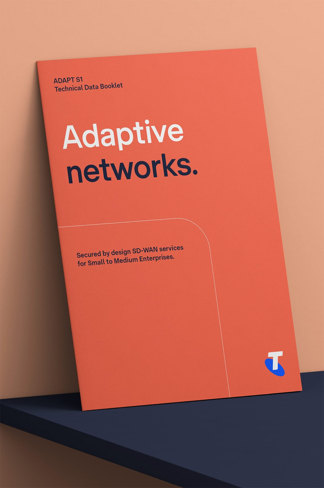
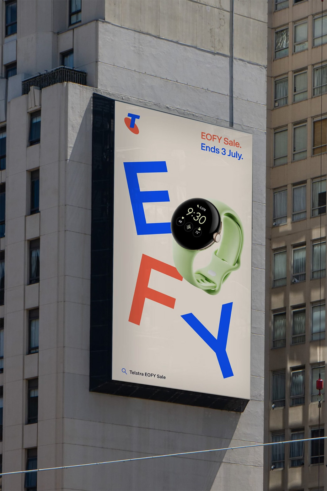
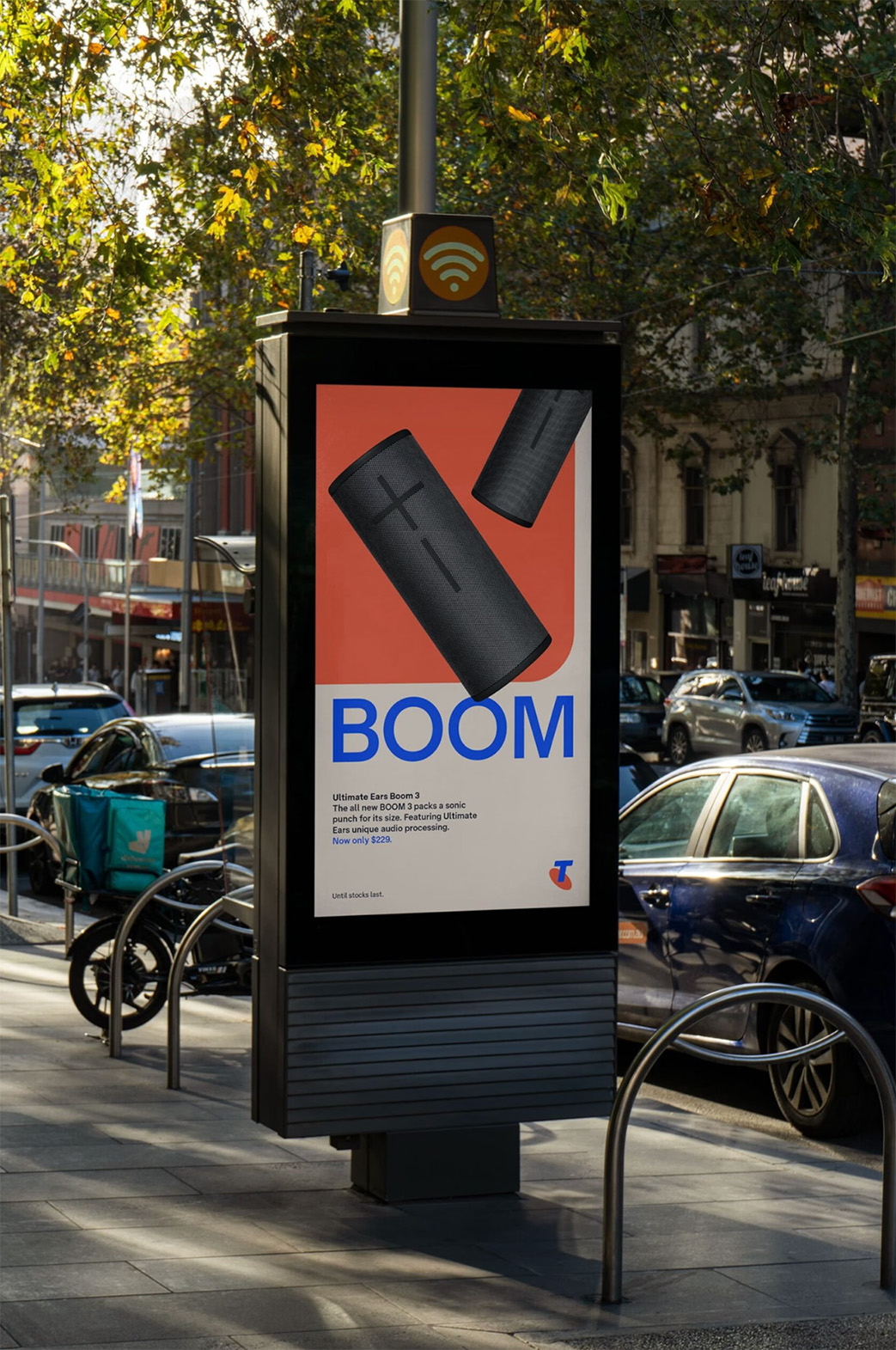
The Telstra typeface was commissioned by Maud Design (now with Droga5) under the direction of Sam Turner, Tomas Sabbatucci and Lachlan Richards. The collection of fonts include a variable Text cut — drawn, spaced and manually-hinted for the most trying environments — and a Display cut, which leans into its more geometric underpinnings. It succeeds Laurenz Brunner’s most excellent Akkurat as the core typeface ensuring it maintains or exceeds Akkurat’s economy and legibility.
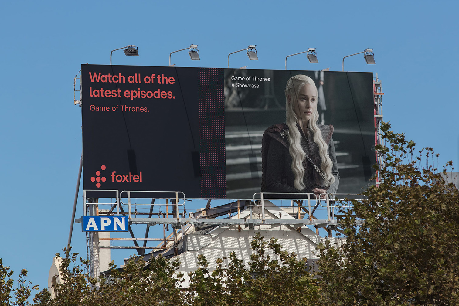
Telstra campaign. Image credit: Droga5.
Telstra campaign. Image credit: Droga5.
Telstra Sim Kit. Image credit: Droga5.
Telstra Technical Data Booklet. Image credit: Droga5.
Telstra EOFY campaign. Image credit: Droga5.
Telstra campaign. Image credit: Droga5.
Telstra DisplayLight, Light Italic
Telstra DisplayRegular Italic, Regular
Telstra DisplayMedium, Medium Italic
Telstra DisplayBold Italic, Bold
Powerhouse Filar
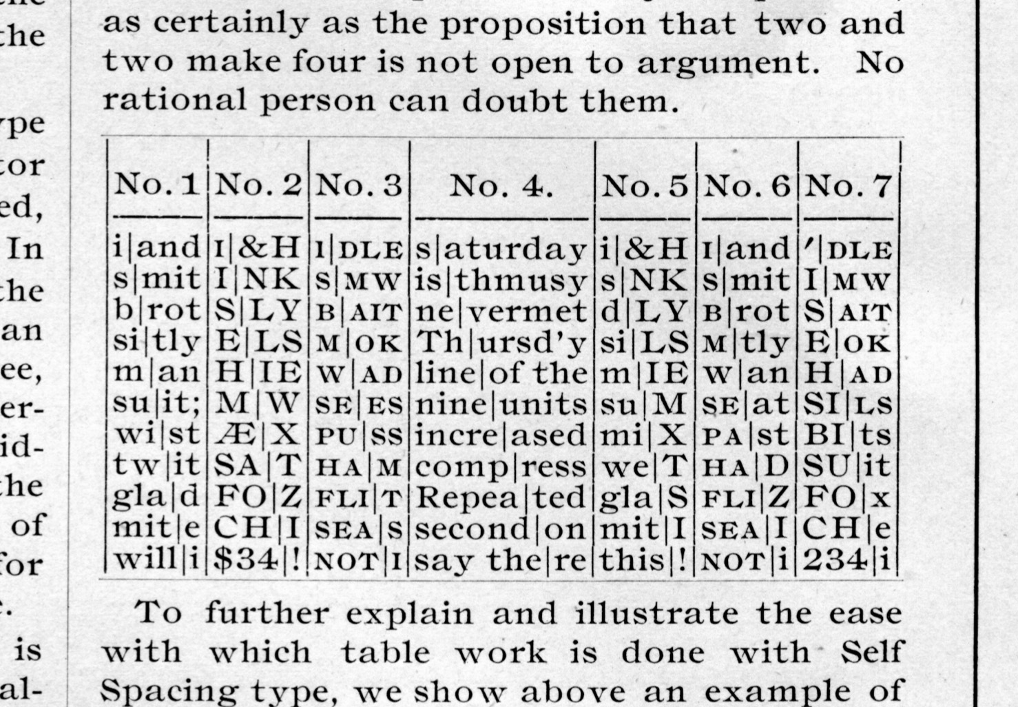
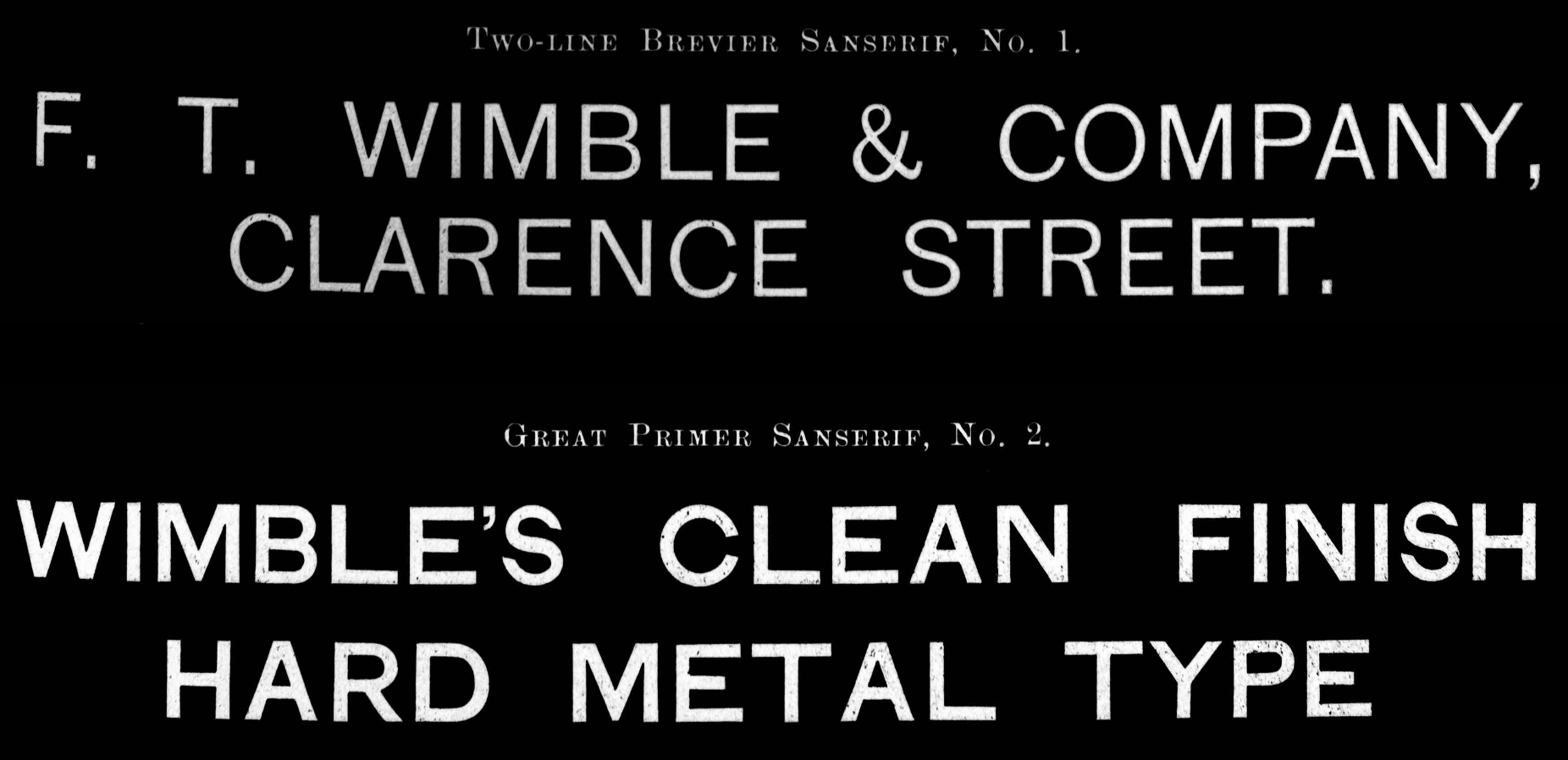
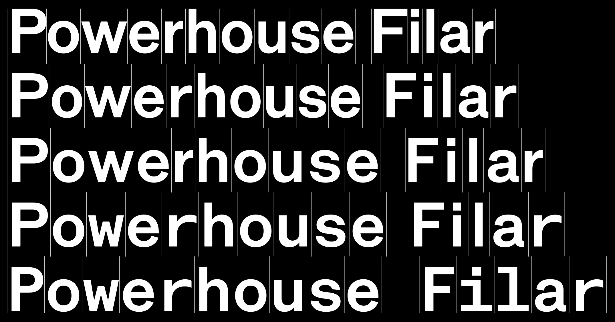
Powerhouse Filar takes cues from various anonymous gothics in the early specimens of Wimble’s Australian Type Foundry. It serves as the house face for Powerhouse and features a unique approach to spacing; across Octo, Quarto, Trio and Mono styles, the typeface creates distinct paragraph textures through its five possible unitisation logics. Production was expertly handled by Wei Huang. Powerhouse Filar will soon be available as an open source typeface. Please stay tuned.
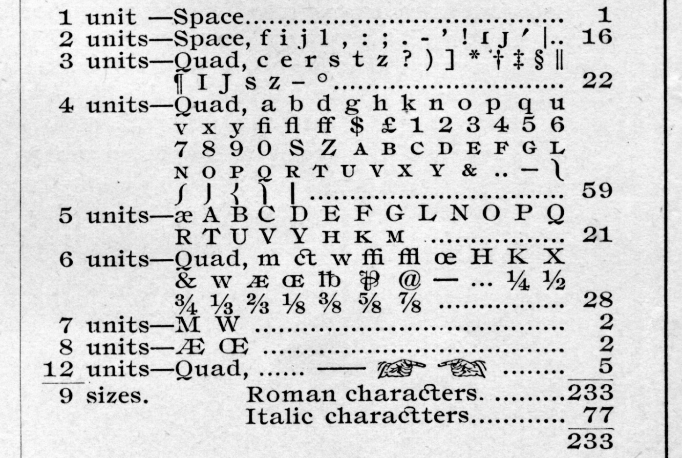
Linn Boyd Benton‘s Self Spacing Type, 1883.
Linn Boyd Benton‘s Self Spacing Type, 1883.
Sanserif No 1 & No.2, Wimble Australian Type Foundry, c.1900.
Gothic No. 1, Wimble Australian Type Foundry, c.1900.
Filar’s unitisation logic.
Powerhouse FilarRegular, Regular Italic
Powerhouse Filar OctoMedium, Medium Italic
Powerhouse Filar QuartoSemibold, Semibold Italic
Powerhouse Filar TrioBold, Bold Italic
Powerhouse Filar MonoBold, Bold Italic
Powerhouse Cambium
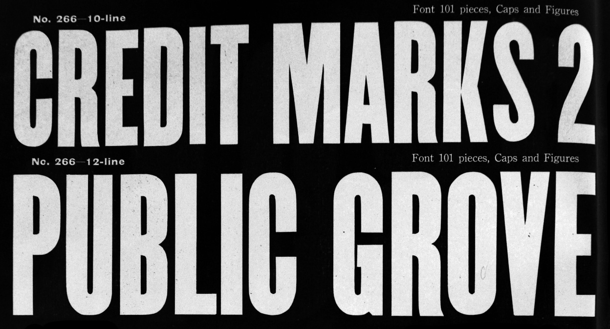
Powerhouse Cambium is loosely inspired by wood type Series No. 266 from No. 4 catalogue of F.T. Wimble & Company (imported from the Hamilton Manufacturing Company) and tram destination rolls at Ultimo. It features chamfered counterforms and leans into the inherent weight gained at junctures.
Tram destination roll, New South Wales Government Tramways, Australia, c1959.
Series No. 266, Catalogue No.4, Hamilton Manufacturing Company, FT Wimble and Co. Ltd. 1923
Powerhouse CambiumBlack
Powerhouse CambiumBlack
Powerhouse CambiumBlack
Powerhouse CambiumBlack
Powerhouse CambiumBlack
Powerhouse Punctum
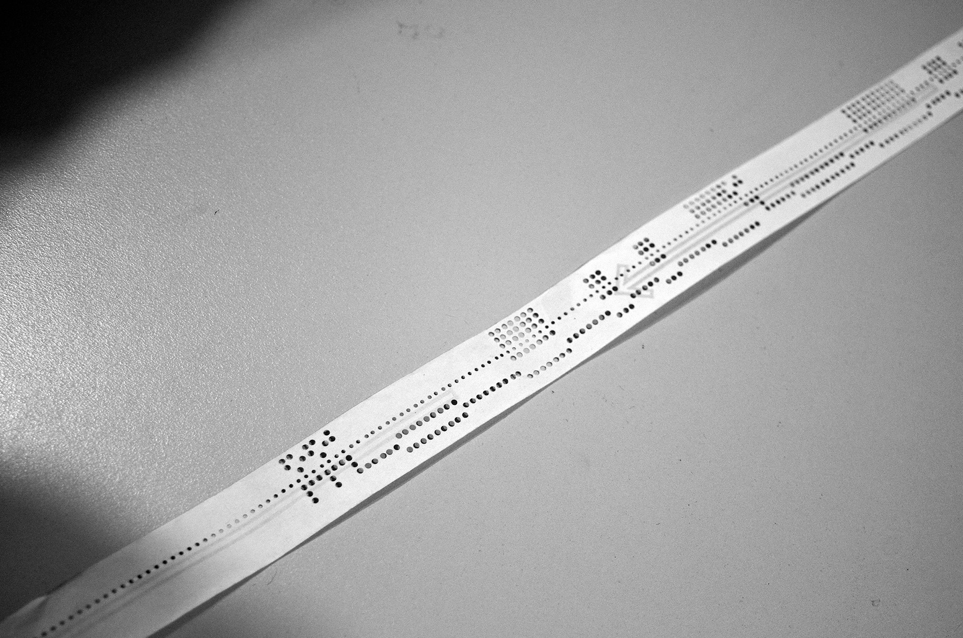
Powerhouse Punctum draws on the language of punchcards, receipt printers and digital interfaces. The 12-font family is orientated on 3 axes: X Transposer, Y Transposer and Amplitude. As these axes are modulated, the typeface swells, degrades, multiplies and disintegrates, embracing the potential of puncture and porousness.
Punch card for 'Powers' Mechanical accounting machine, c.1955.
Punch cards on a Jacquard Loom, 1875–1900.
'Symphonion Simplex' disc by Symphonion Musikwerke, Germany c.1890.
Pong source code, 1978.
Powerhouse Punctum919
Powerhouse Punctum915
Powerhouse Punctum195
Powerhouse Punctum191
Powerhouse Punctum111
Caruso
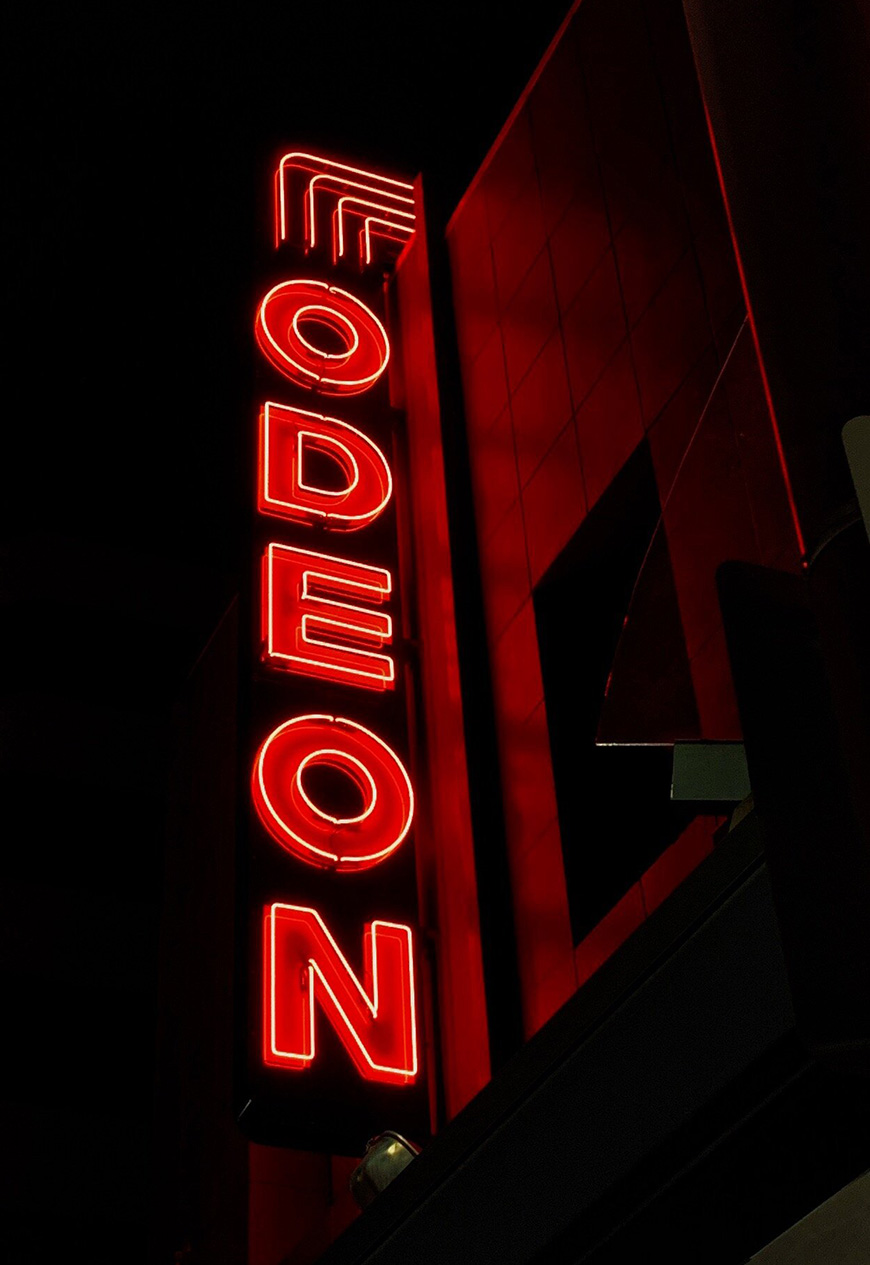
Caruso was commissioned by DarkLab for the Odeon Theatre. Extending on a limited number of glyphs on the current neon sign, it is an all-caps, low-contrast, geometric sans serif. It features solid and outline style and carries the monumentality and wide stature characteristic of the Odeon Theatre signage.
The Odeon Theatre’s iconic neon signage.
CarusoBold
CarusoBold Outline
CarusoBold
CarusoBold Outline
CarusoBold
CarusoBold Outline
Virideon
Virideon was drawn for live music and cultural precinct, In the Hanging Garden. Inspired by the distinct neon sign in the space, Virideon is an all-caps, largely geometric, rounded sans serif with a tubular construction and irregular stencilling logic. The family includes three weights and a variable font.
In The Hanging Garden, 2022.
VirideonRegular
VirideonRegular
VirideonMedium
VirideonMedium
VirideonBold
Fereday
Feredy serves as the logotype and house typeface of furniture and product design studio TOMFEREDAY. As a nod to the practice’s penchant for technical experimentation the letterforms draw on the vernacular of technical lettering found commonly in routing, milling and plotter environments.
Fereday employs a unitisation logic limiting possible character widths.
The typeface includes a range of glyphs based on the processes and machinery used by the studio.
Allan Hershey’s drawings for what would become The Hershey Fonts.
The fonts available on the NC-Scriber CS2020.
FeredayHairline
FeredayLight
FeredayRegular
FeredayBold
Preston
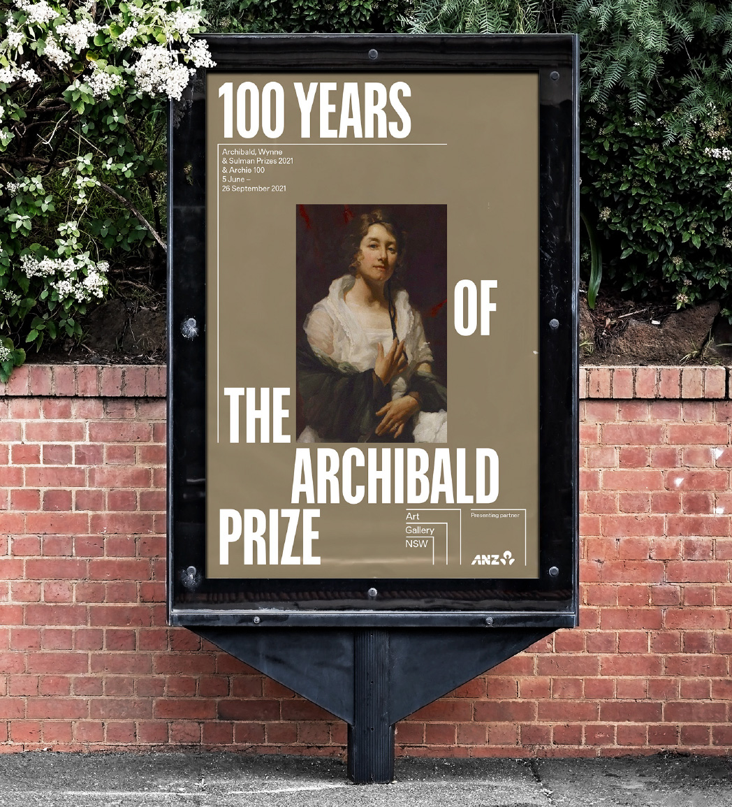
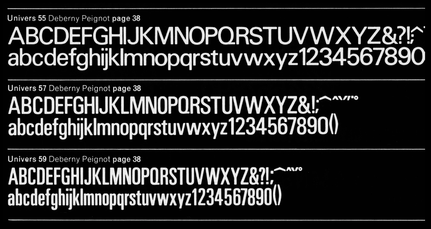
Preston was drawn for the Art Gallery of New South Wales and references the prevalence of Adrian Frutiger’s iconic Univers typeface throughout the 1960s–90s in Australian graphic design. Preston could be considered a work of historical fiction. It attempts to channel a particular attitude, affectionately termed Mongrel Modernism — a kind of Antipodean-digested version of European ideals. Preston is named in honour of Sydney modernist, artist and designer Margaret Preston.
Miscellaneous Art Gallery of NSW pamphlets, AGNSW Design Studio.
Poster advertising 100 years of the Archibald Prize, AGNSW Design Studio.
Sun Books, the antipodean response to Penguin books, source: Re:collection.
Adrian Frutiger’s famed Univers typeface, a conceptual starting point for Preston.
Preston X CondBold
Preston CondBold
PrestonLight, Regular Italic, Medium
Brut
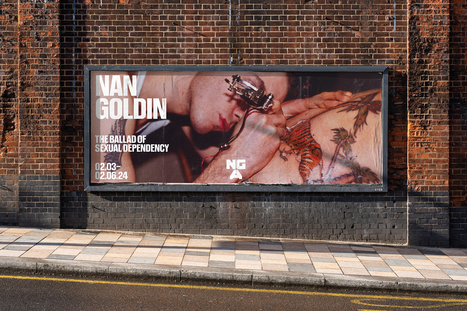
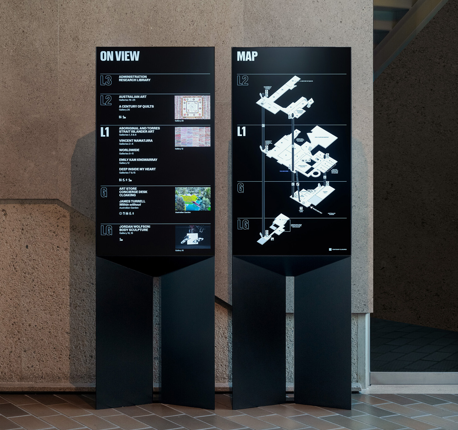
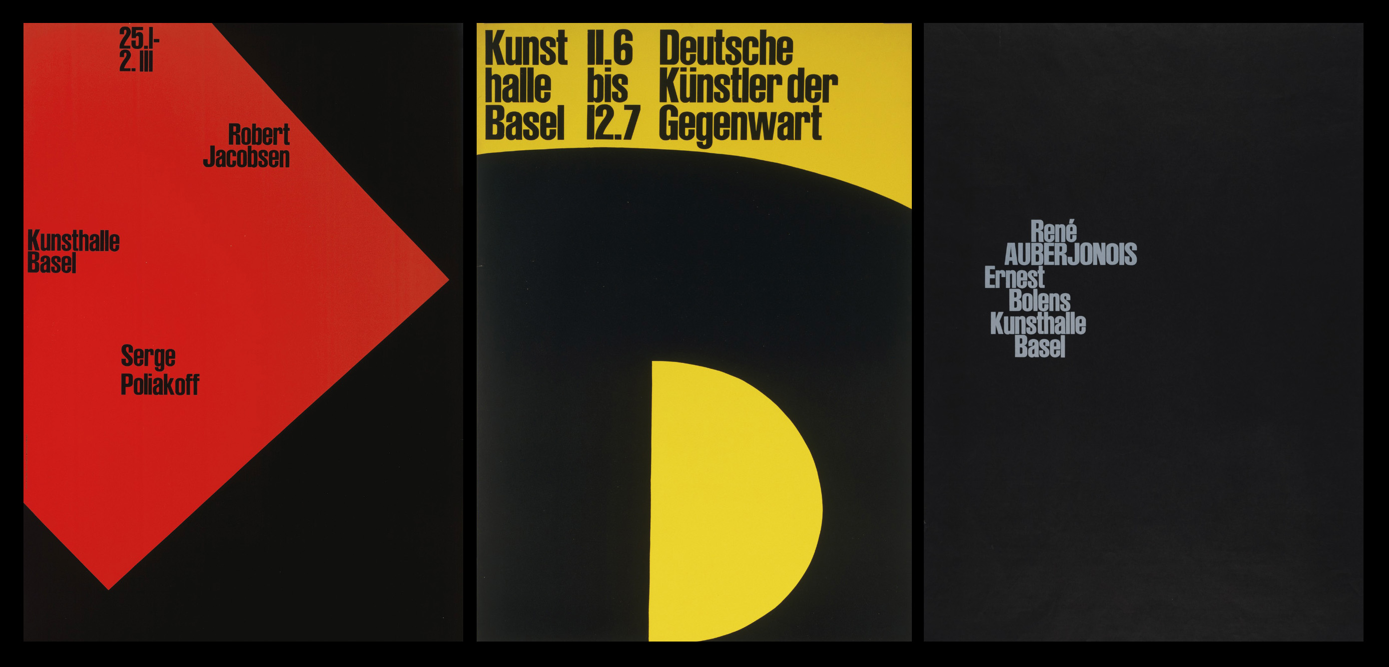
Brut was drawn for the National Gallery of Australia. Adopting the gallery’s principle of trans-historicism, it samples and re-mixes various grotesks across time and place including Bauer Type Foundry’s Folio Condensed (1956) & Venus Extended (1911) and Stempel Type Foundry’s Reform Grotesk (1904–1925).
Nan Goldin street poster. Image credit: Studio Ongarato.
National Gallery of Australia signage. Image credit: Studio Ongarato.
Various posters for the Kunsthalle Basel, Armin Hofmann, Linocut, 128 x 90.4 cm.
Reform Grotesk, designers unknown, Stempel 1900.
Brut ExtBold, Bold Italic
Brut CondBold, Bold Italic
BrutRegular, Italic, Bold, Bold Italic
BVN Open
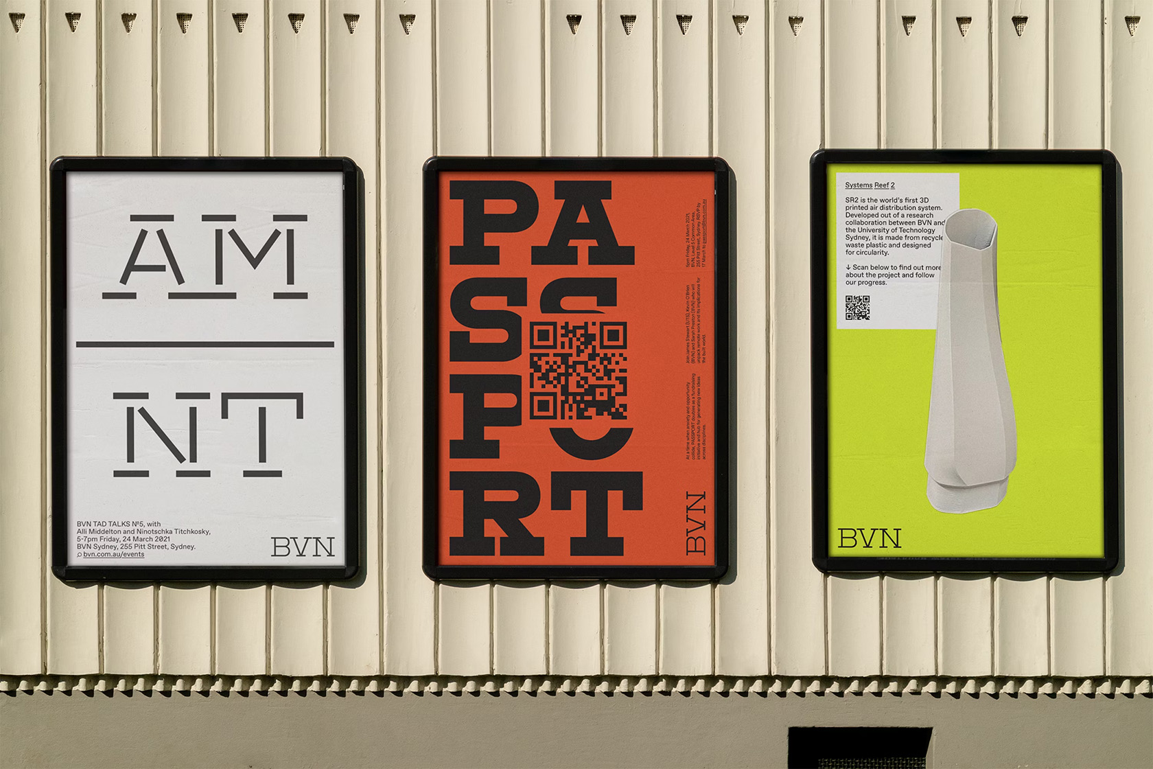
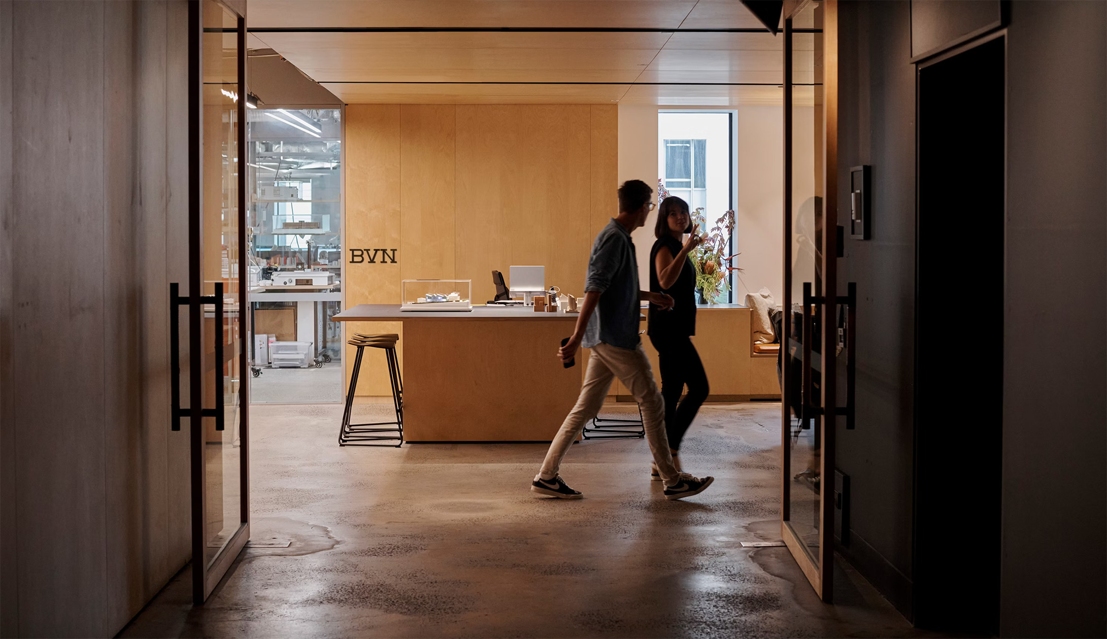
BVN Open was commissioned by Base Design for BVN Architecure, a collective of architects, designers, researchers and makers with offices in Sydney, Brisbane, London and New York. Its wide gait, low-contrast and unapologetic slab serifs reference the language of scaffolding and built forms. A unique stencil cut creates a distinct rhythm through its unconventional deconstruction and even spacing.
BVN event posters. Image credit: Base Design.
BVN Stencil Black, B.
BVN offices.
BVN OpenRegular
BVN Open StencilMedium
BVN OpenSemibold
BVN Open StencilBold
BVN OpenExtrabold
BVN Open StencilBlack
Obelisc
Obelisc is geometric sans serif commissioned by Design Studio for Go1, the largest online learning library in the world. It takes specific cues from Ludwig & Mayer’s Erbar Grotesk ensuring it remains distinct and economical.
Erbar-Grotesk by Ludwig & Mayer, 1926.
Erbar-Grotesk by Ludwig & Mayer, 1926.
ObeliscRegular & Regular Italic
ObeliscMedium & Medium Italic
ObeliscBold & Bold Italic
Internal
Internal is the house typeface of The Company You Keep. Commissioned and collaboratively designed with the studio, its pragmatic, functional forms are tempered by a myriad of alternates and prebuilt glyphs drawing on the aesthetics of administration. Injections of whimsy and play serve as a kind of shorthand for the trappings of studio life.
All Content Remains the Work of Others, Browns Books Archive (2018–2025), TCYK.
Folio, Bauer, 1957
Akzidenz Grotesk, Berthold, ca. 1898.
InternalLight
InternalLight
InternalLight
InternalMedium
InternalMedium
InternalMedium
MIFF Title
MIFF Title is a custom display face designed in collaboration with Ross Paxman of Maud Design (Droga5) for the Melbourne International Film Festival. It is a geometric colour font that comes in two layers referencing the language of film projectors.
MIFF No. 69 street poster campaign, Maud (Droga5), 2021.
MIFF street poster campaign, Maud (Droga5), 2020.
MIFF No. 69 street poster campaign, Maud (Droga5), 2021.
MIFF TitleSolid & Overlap
MIFF TitleSolid & Overlap
MIFF TitleSolid & Overlap
MIFF TitleSolid & Overlap
MIFF TitleSolid & Overlap
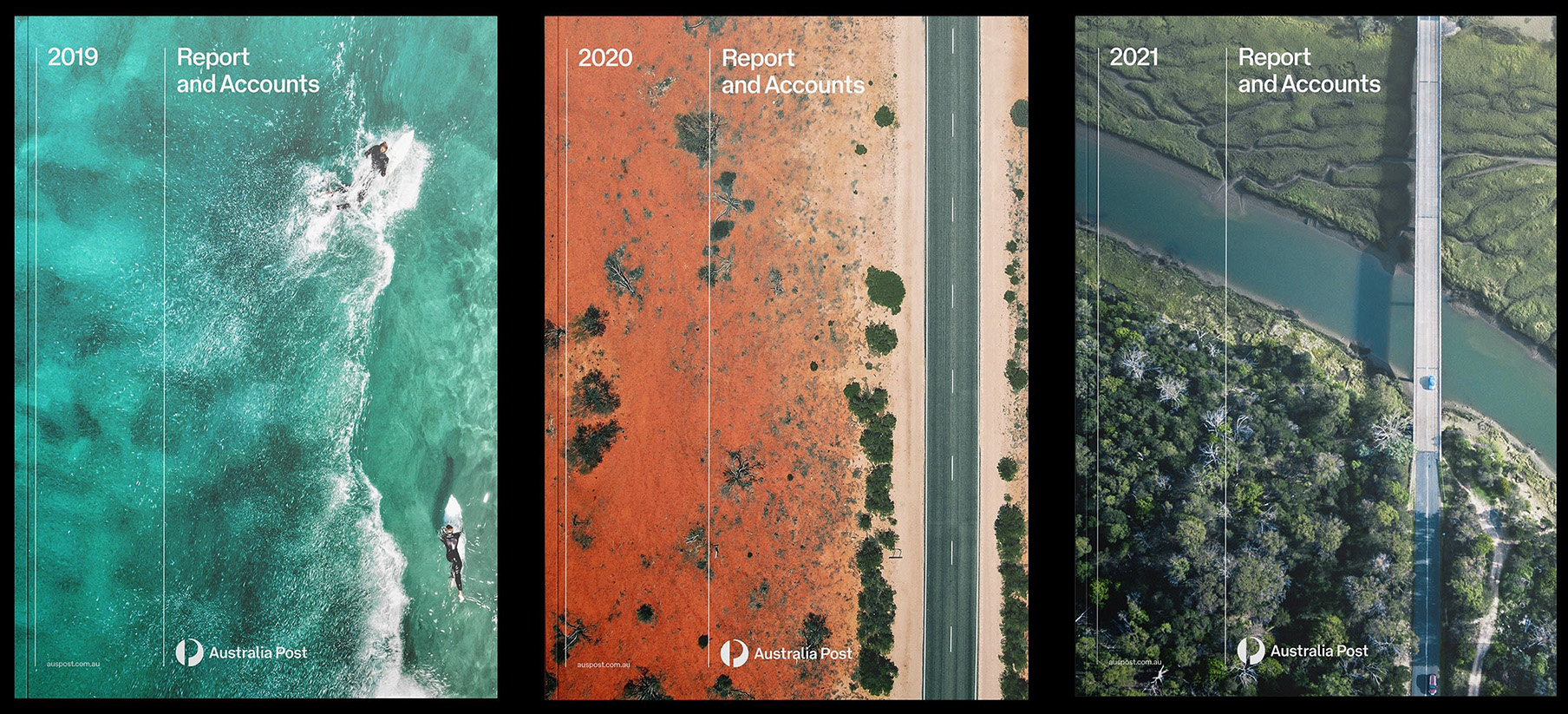
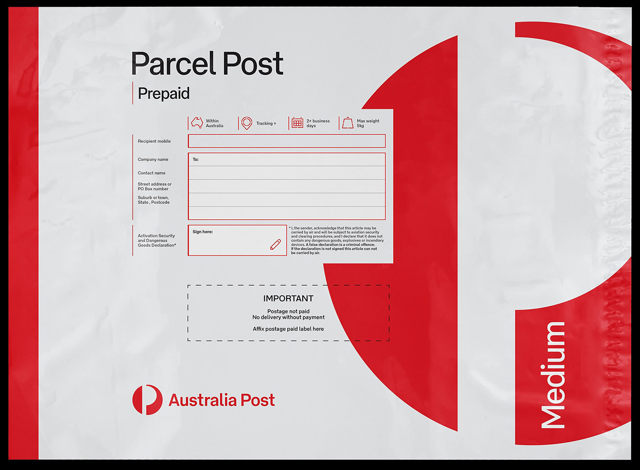
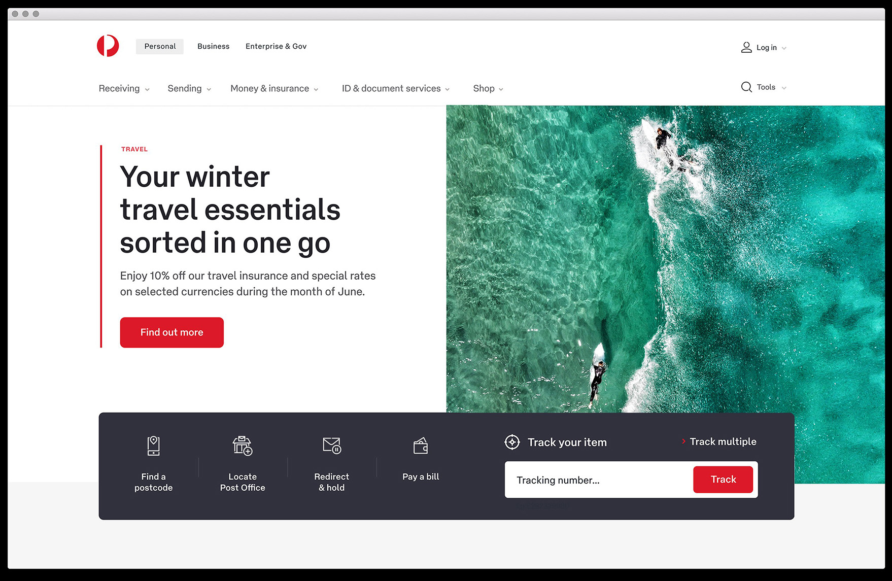
AP Type
Australia Post is the government-owned corporation that provides postal services throughout Australia. As part of a significant brand architecture evolution we collaborated with Maud Design (now Droga5) to create a custom typeface to be used throughout their entire network; from vehicle livery and parcel packaging to retail signage and digital assets. We delivered two dedicated optical sizes for display and text sizes across four weights as well as a custom logotype font.
Australia Post vehicle livery, Droga5.
Australia Post documents, Droga5.
Parcel Post Prepaid Satchel, Droga5.
www.auspost.com.au
APType DisplayLight, Light Italic
APType DisplayRegular, Regular Italic
APType DisplayMedium, Medium Italic
APType DisplayBold, Bold Italic
Transfer
Transfer is custom signage face commissioned by Buro North for Melbourne Airport. Scoped initially throughout Terminal 4, it has since found its way throughout the airport. Transfer references particular vernacular letters around Melbourne including the iconic Flinders Street platform signs.
TransferLight
TransferRegular
TransferBold
Grandstand
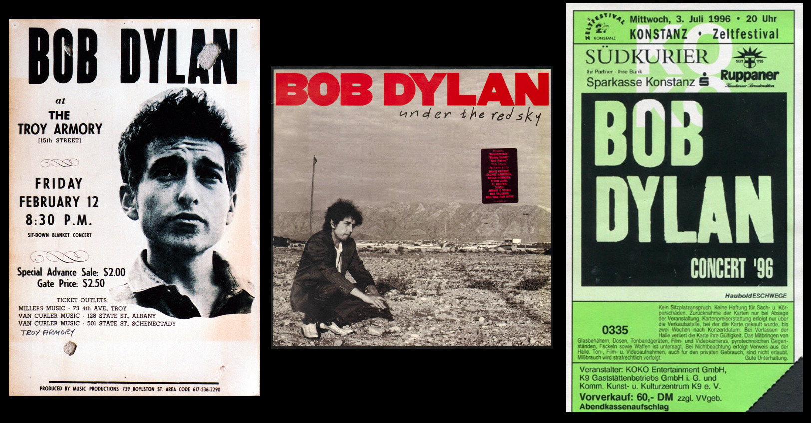
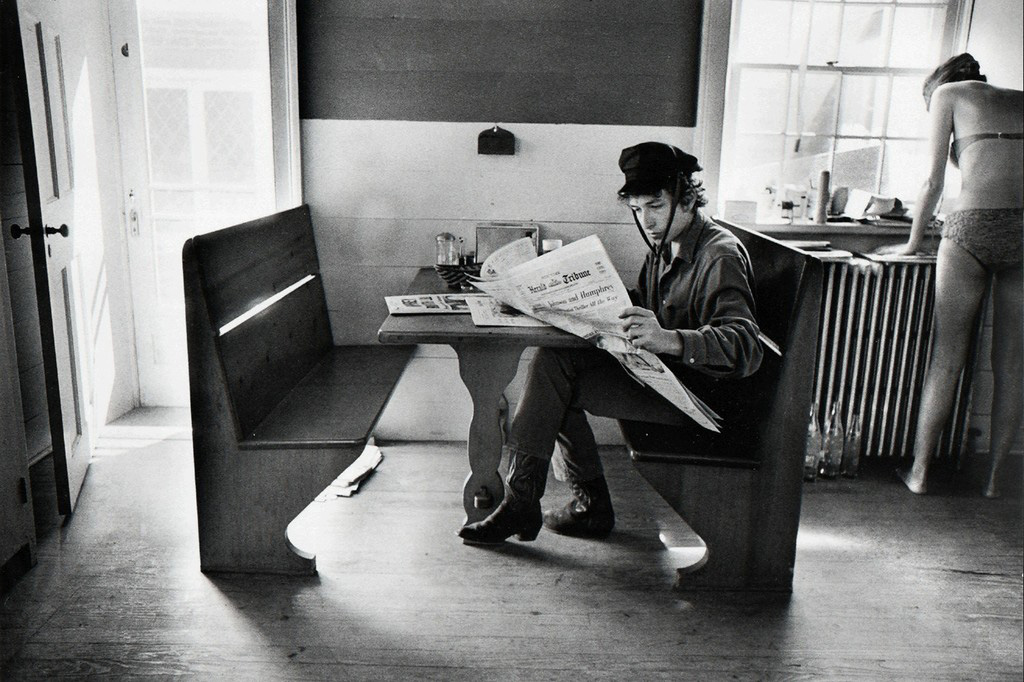
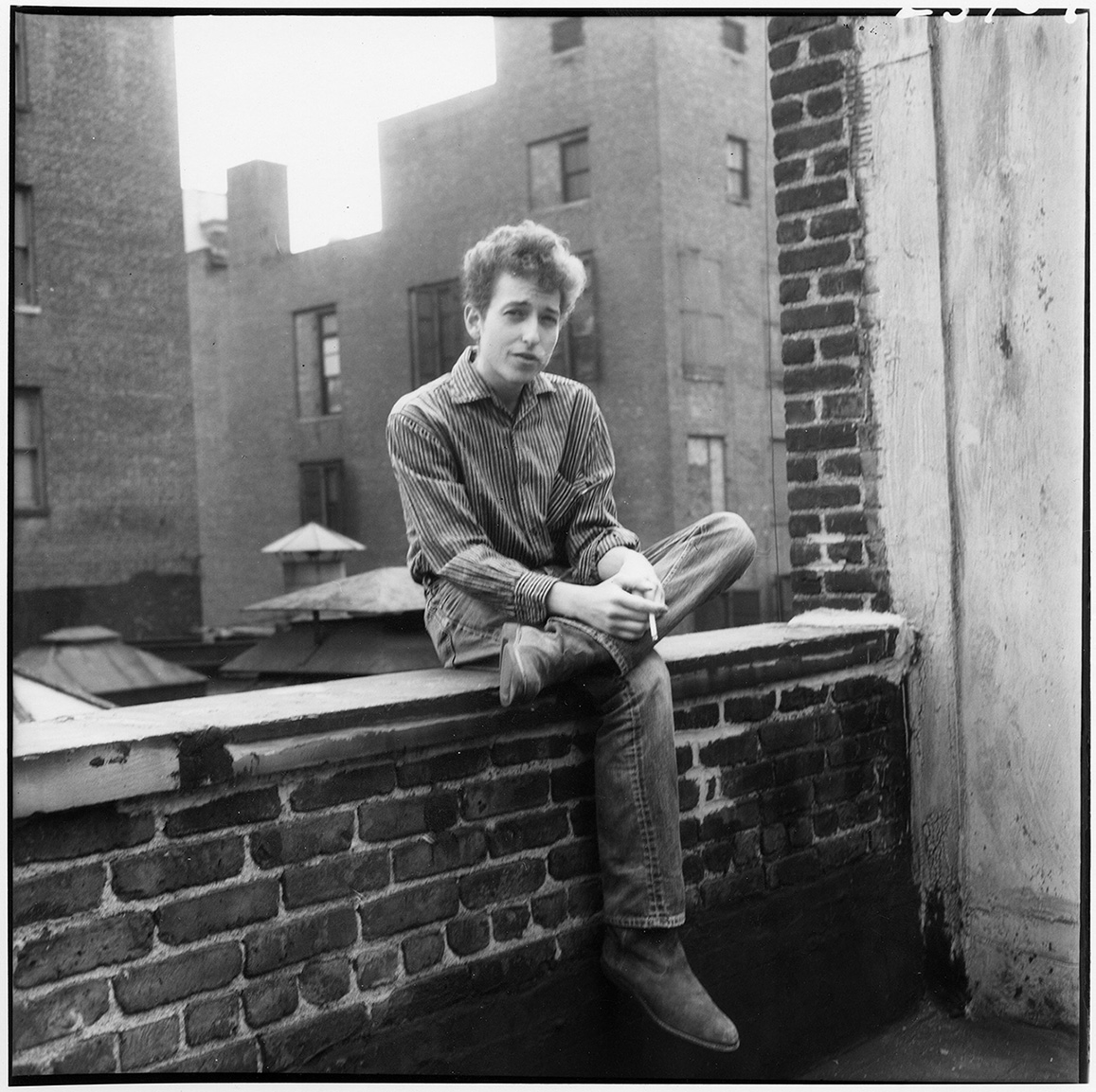
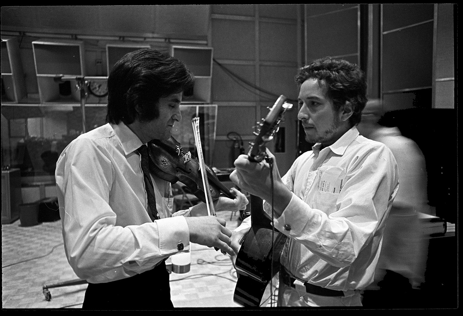
Grandstand is one of a trio of typefaces commissioned by Base Design for the Bob Dylan Center. Drawing upon vernacular American sans serifs, woodblock poster printing and specific samples within the archive, Grandstand is a narrow, heavy, flatsided typeface with distinct moments of irregularity and heightened idiosyncracy.
GrandstandBlack
Grandstand CompactBlack
Telegram
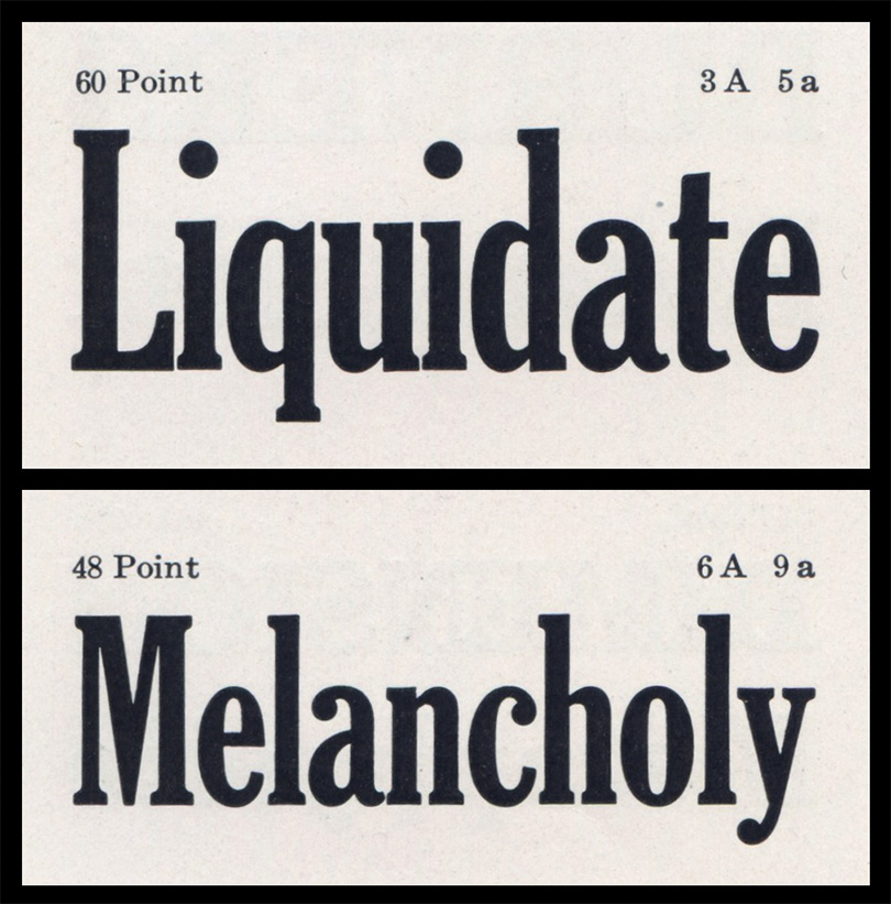
Telegram references US newspaper faces of the 60s, specifically Cheltenham and Century Expanded. It carries a literary tone with the same capheight and ascender height as Grandstand though the x-height is lowered to give a more elegant proportion.
TelegramBold
TelegramBold
TelegramBold
TelegramBold
Passenger
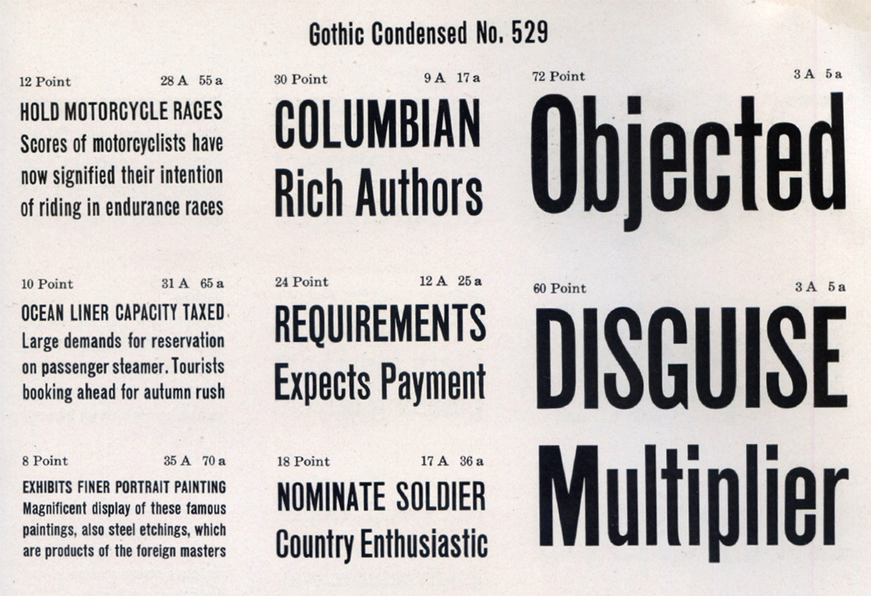
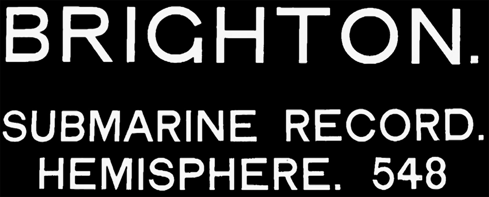
Passenger is an American Gothic, drawing on some of the earliest sans serifs from the White Foundry of New York c1830. It serves as the workhorse text face for the Bob Dylan Center.
PassengerRegular
PassengerMedium
PassengerSemibold
PassengerBold
Verity
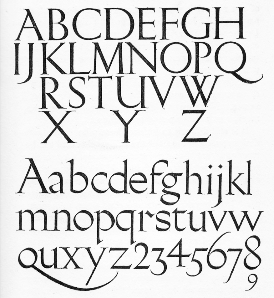
Verity was drawn for Australian fashion designer Lee Mathews. Their use of Gill Sans logo prompted a search for an sharp and elegant letterform in Gill‘s oeuvre. The primary point of reference became Gill’s signwriting guide designed circa 1903 for W. H. Smith & Son.
VerityLight
VerityLight Italic
VerityRegular
VerityRegular Italic
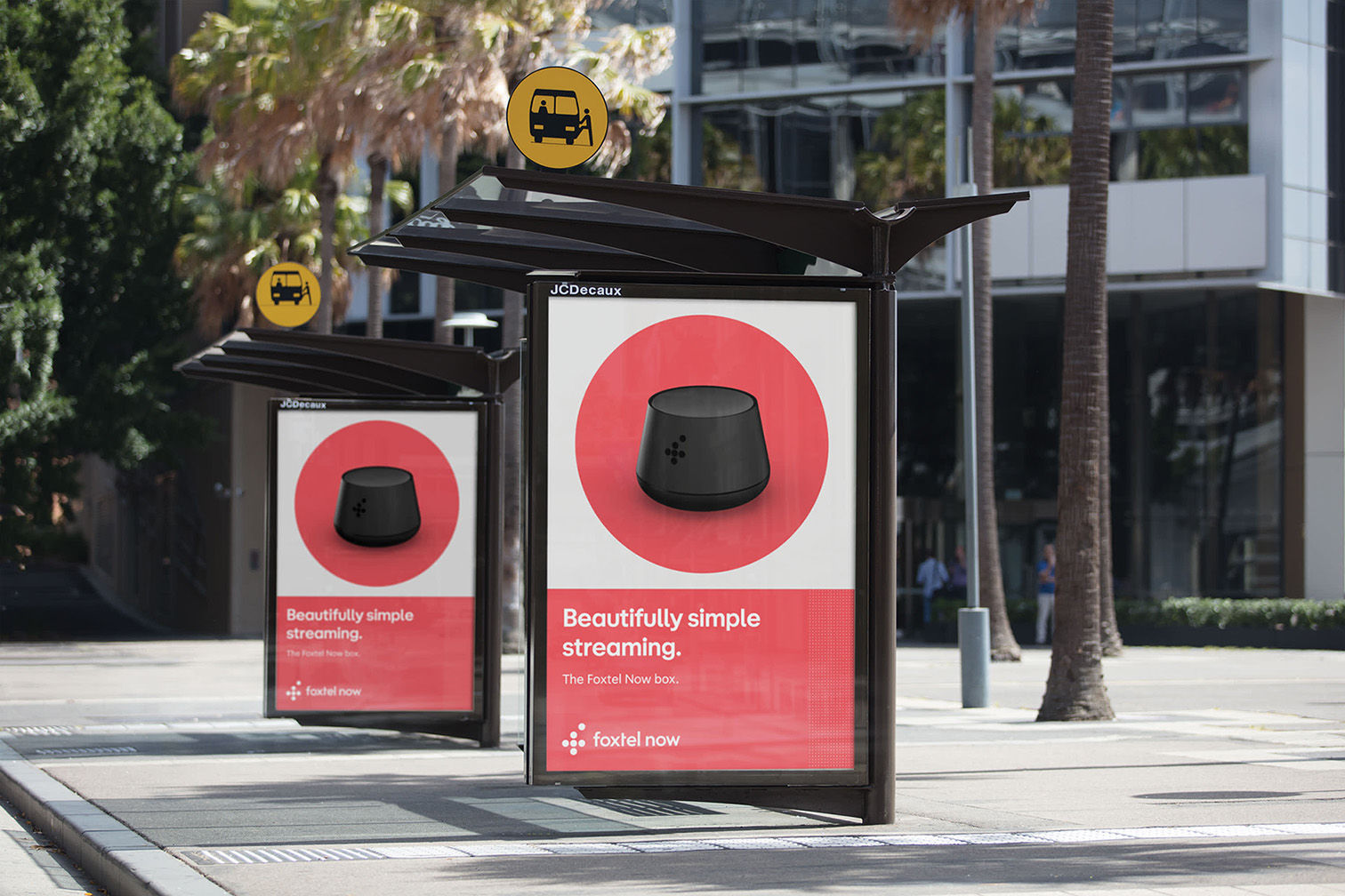
Foxtel
Foxtel is Australia’s largest entertainment producer and broadcaster. In collaboration with Maud, we developed a custom typeface that responded to a new design system based on geometry. The typeface needed to function at various sizes, from billboards to terms and conditions. Our final solution included Display and Text cuts as well as negative versions to be used when reversed out of solid colours.
Foxtel TitleRegular
Foxtel TitleBold
Foxtel TextRegular and Regular Italic
Foxtel TextRegular Bold and Bold Italic
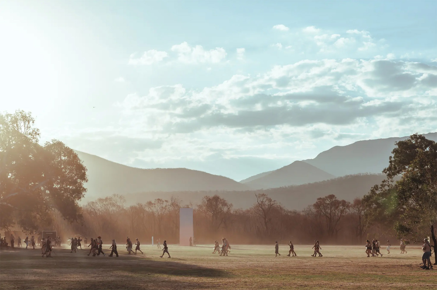
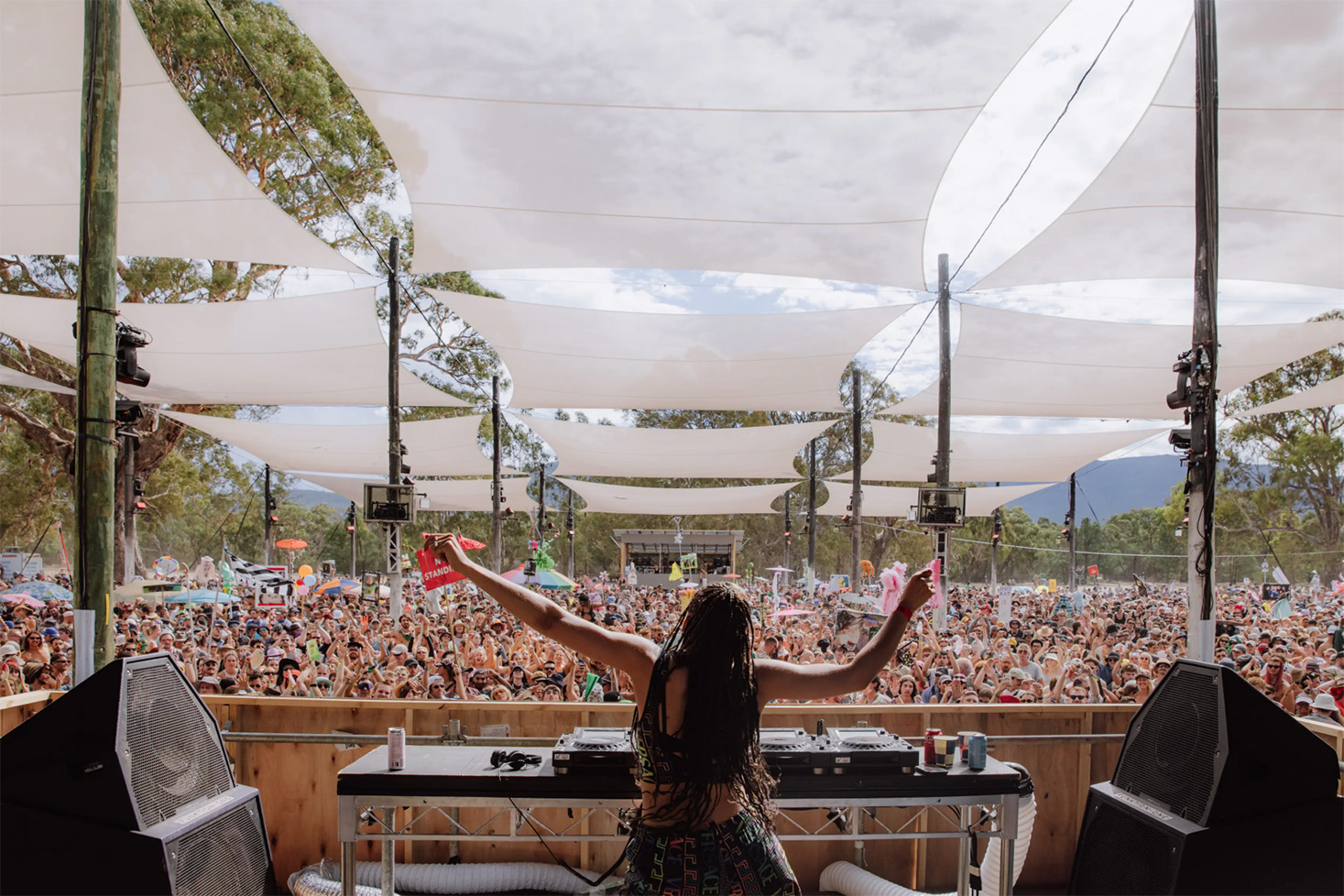
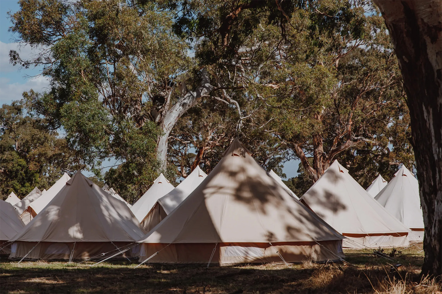
PMA Sans
Pitch Music and Arts is a four day festival of electronic music and contemporary art situated in rural Victoria. It has quickly become renown for its colossal, futuristic stages and world-class lineup. Working closely with designer Peter Deering we were fortunate to come in at the ground floor, building a custom typeface that would form the basis of the identity from year one. Each subsequent festival has resulted in an additional style as the family grows in different ways.